yupo

Unity - cityscapes from Ukraine

Back in 2014, I did a series of paintings reflecting on the cities of Ukraine. I called it “Unity,” the wishful thinking motif that many Ukrainians shared when Russia invaded the eastern Ukrainian area of Donbas and took Crimea. These paintings were filled with mourning, longing, and hope. And memories of the Ukraine I had left 11 years earlier. I wasn’t able to revisit it until 2017.

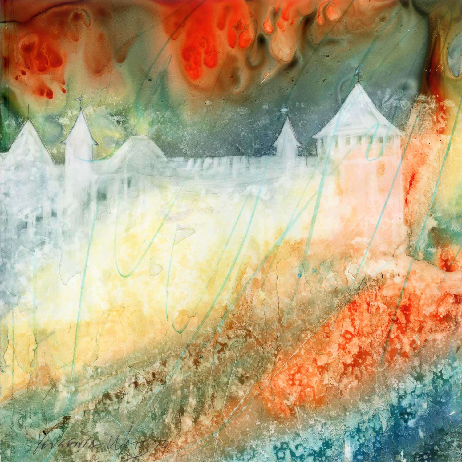
A lot of the paintings look moody and obscure, and some even suggest fires, smoke, and loss. Or am I imagining it, looking back at what I created 9 years later, through the angry eyes of a Ukrainian watching my country being wiped off the face of the Earth by the terrorist state of Russia?
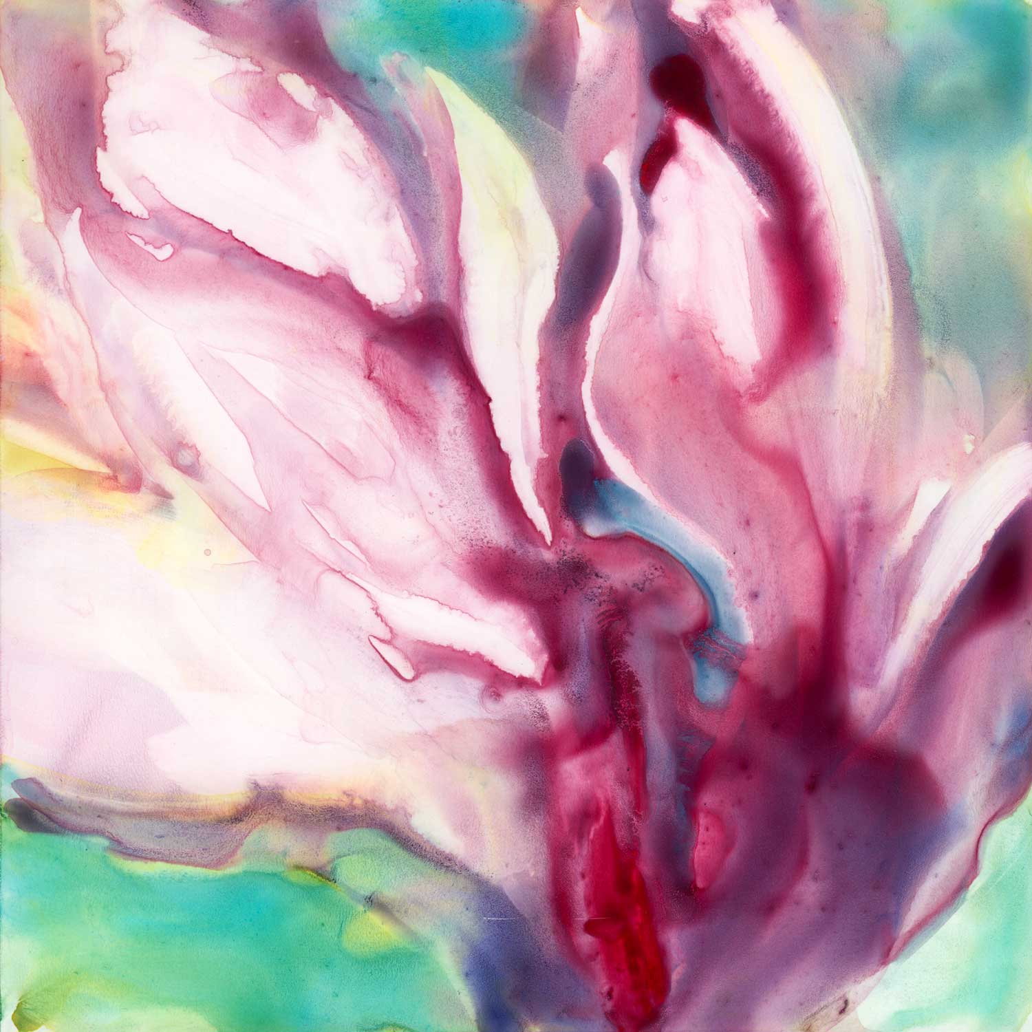
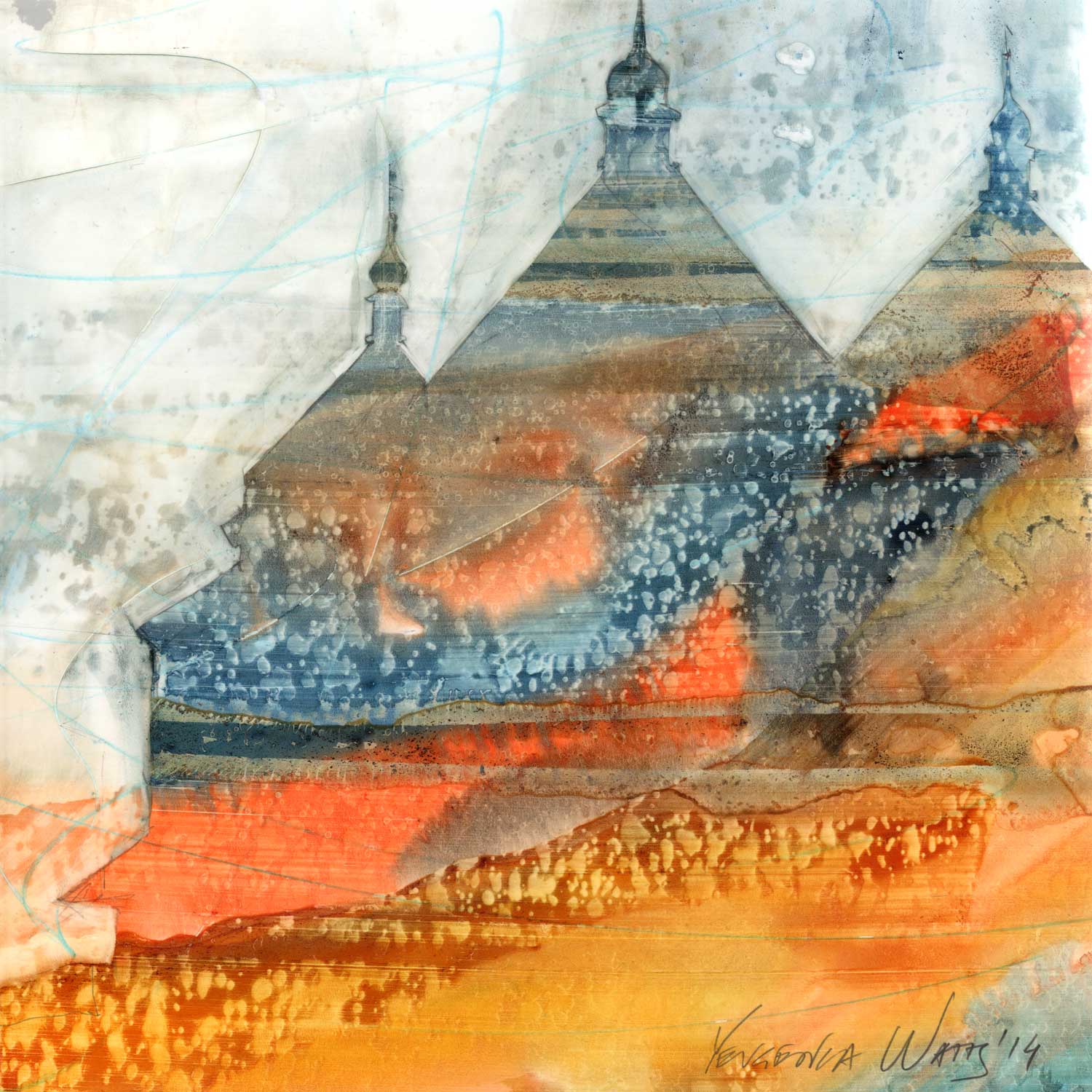
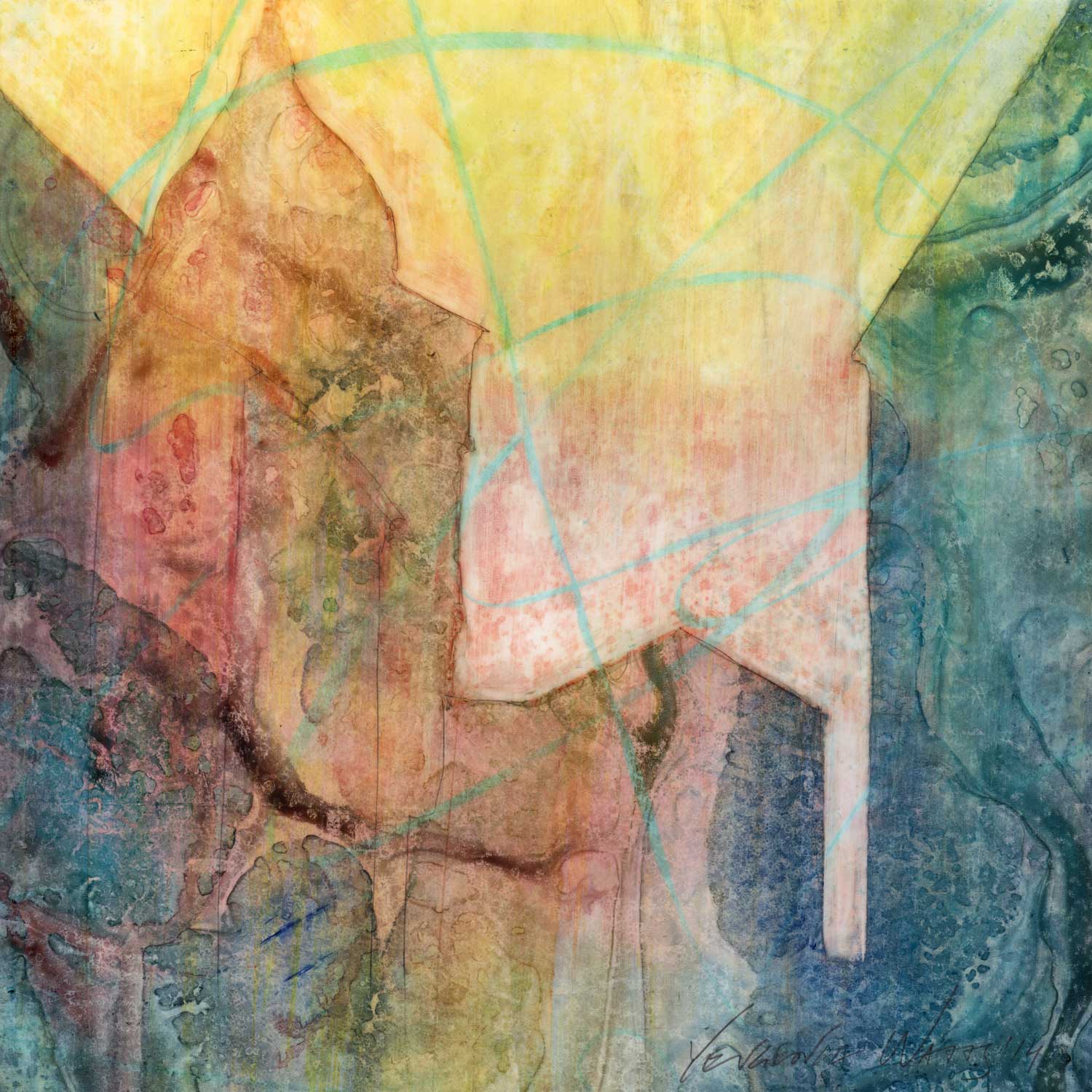
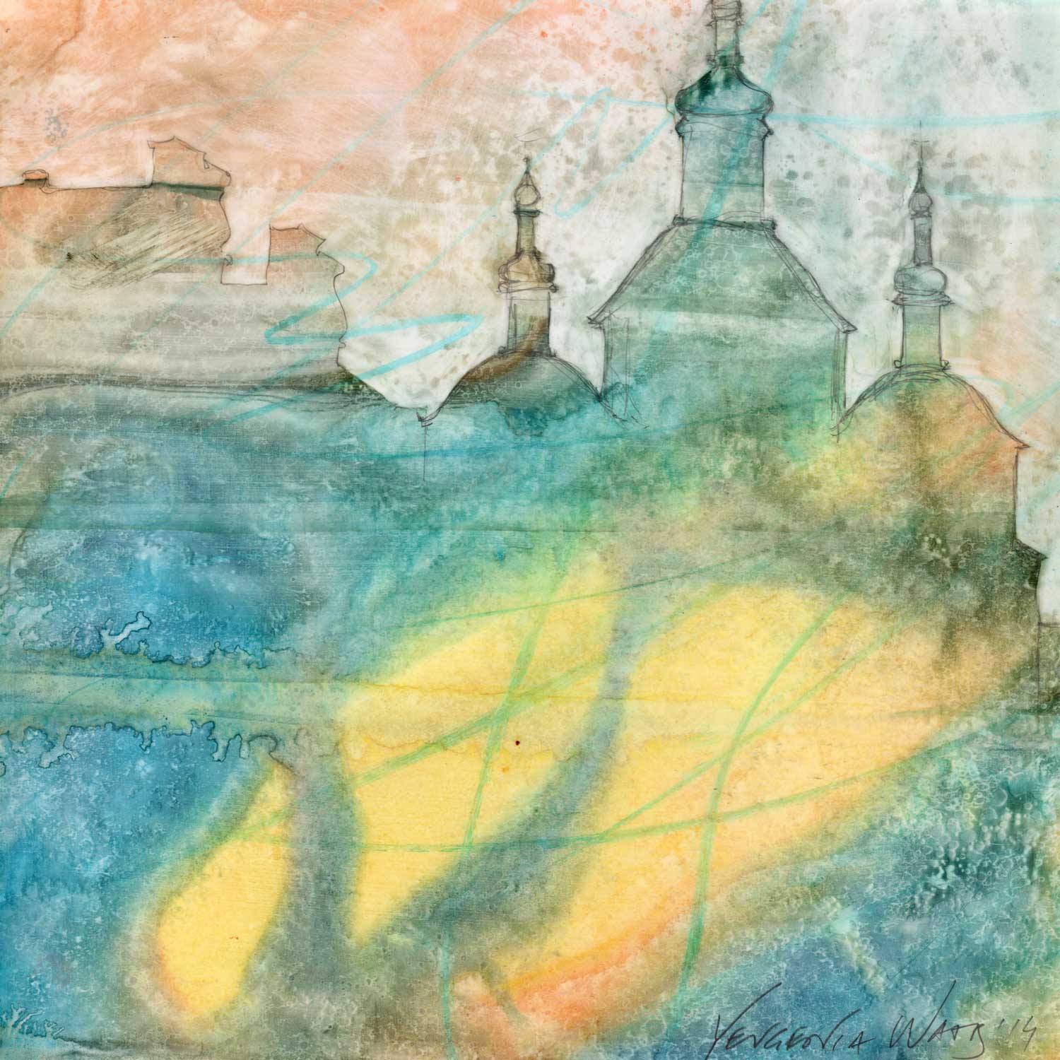
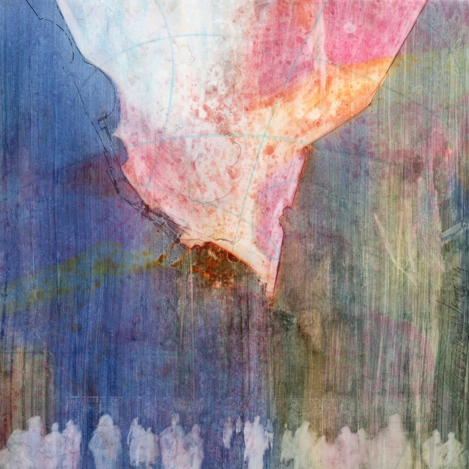
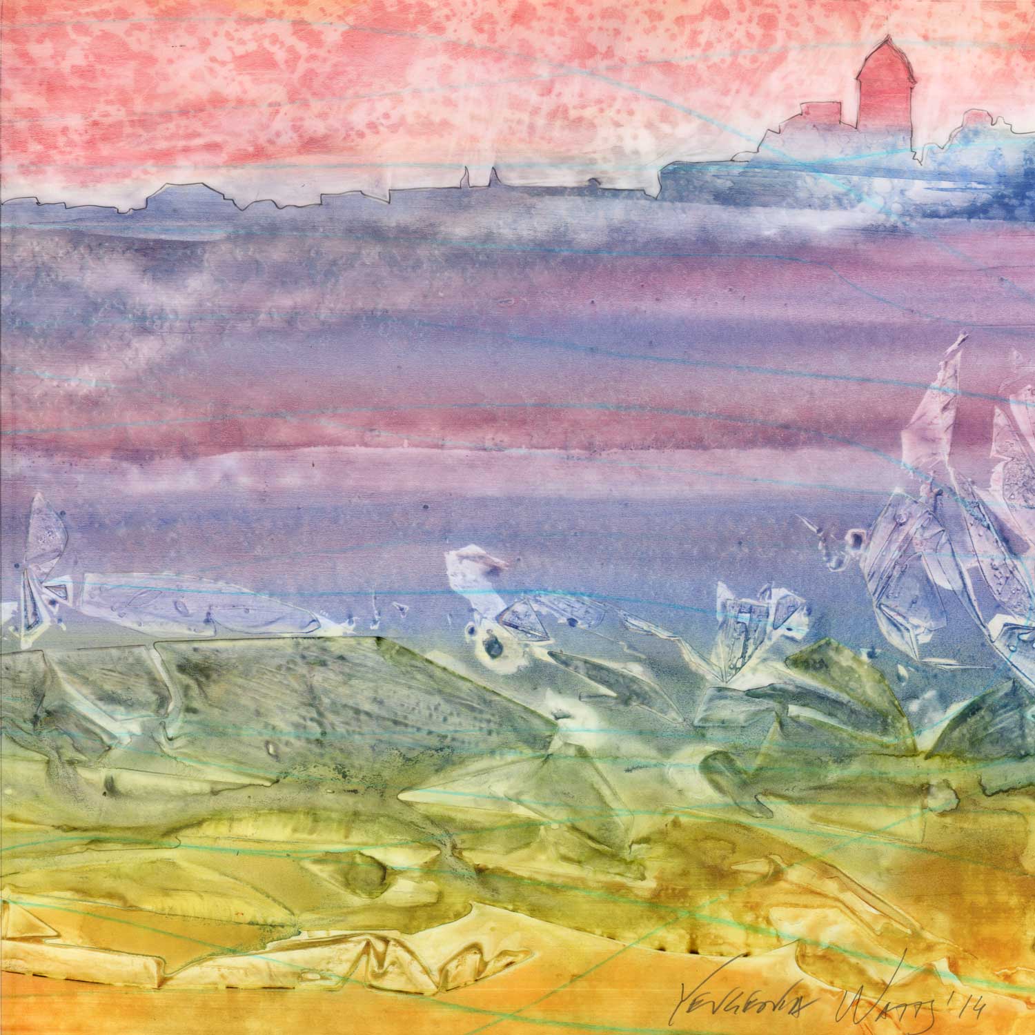
Unity - Crimea

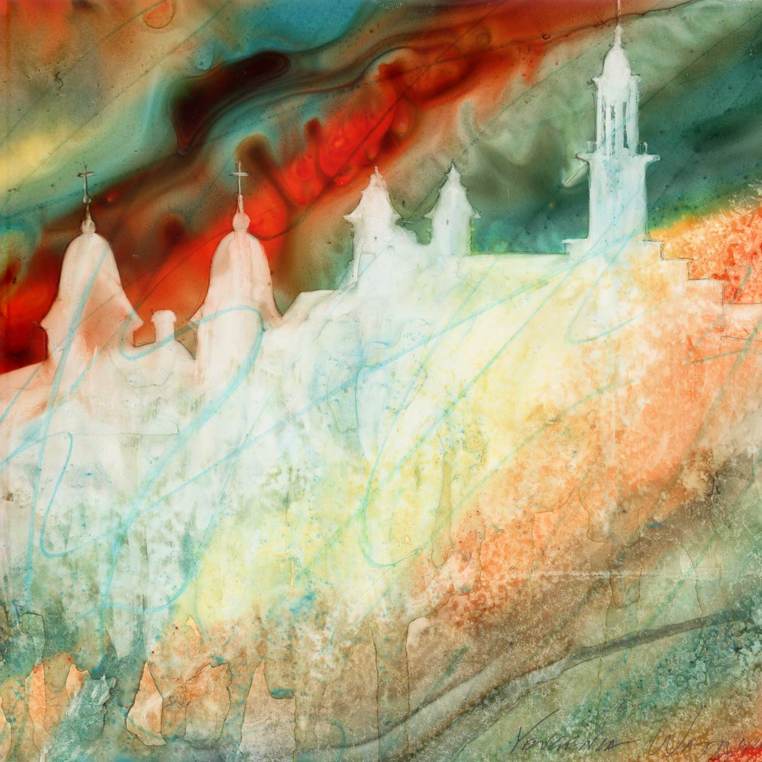
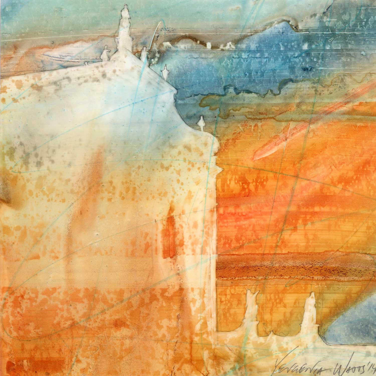
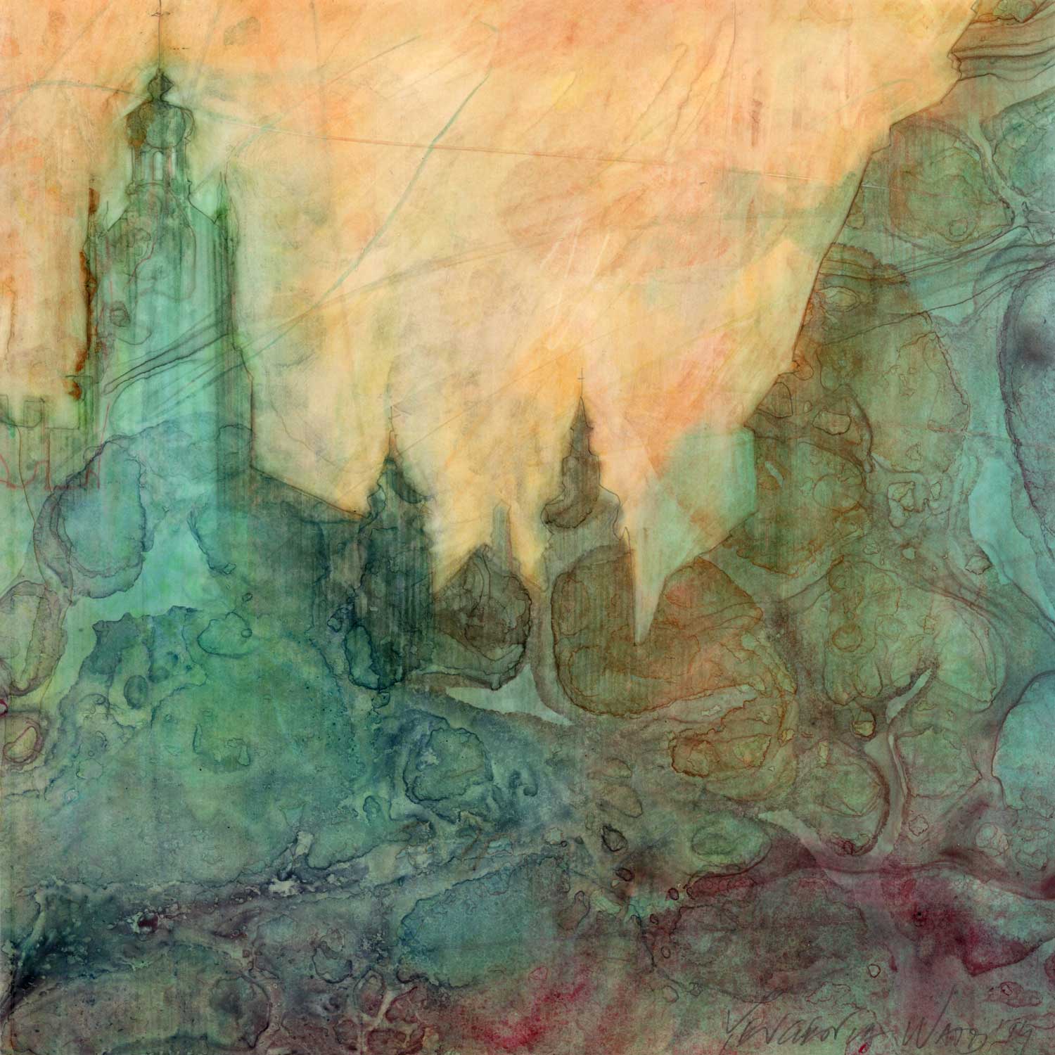
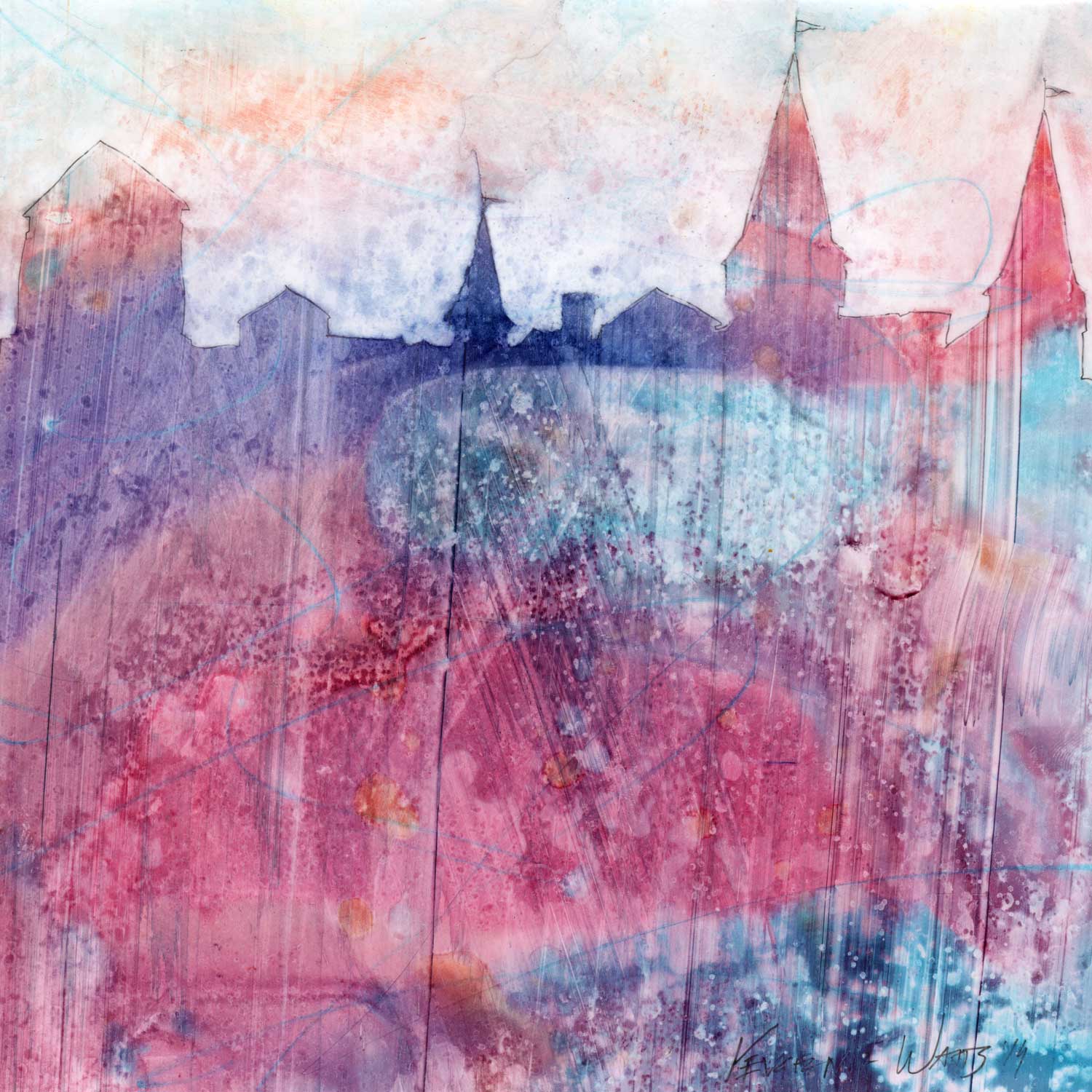
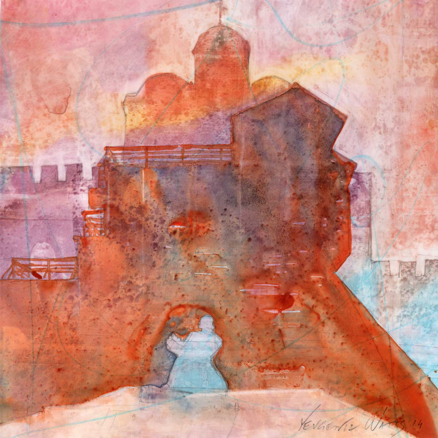
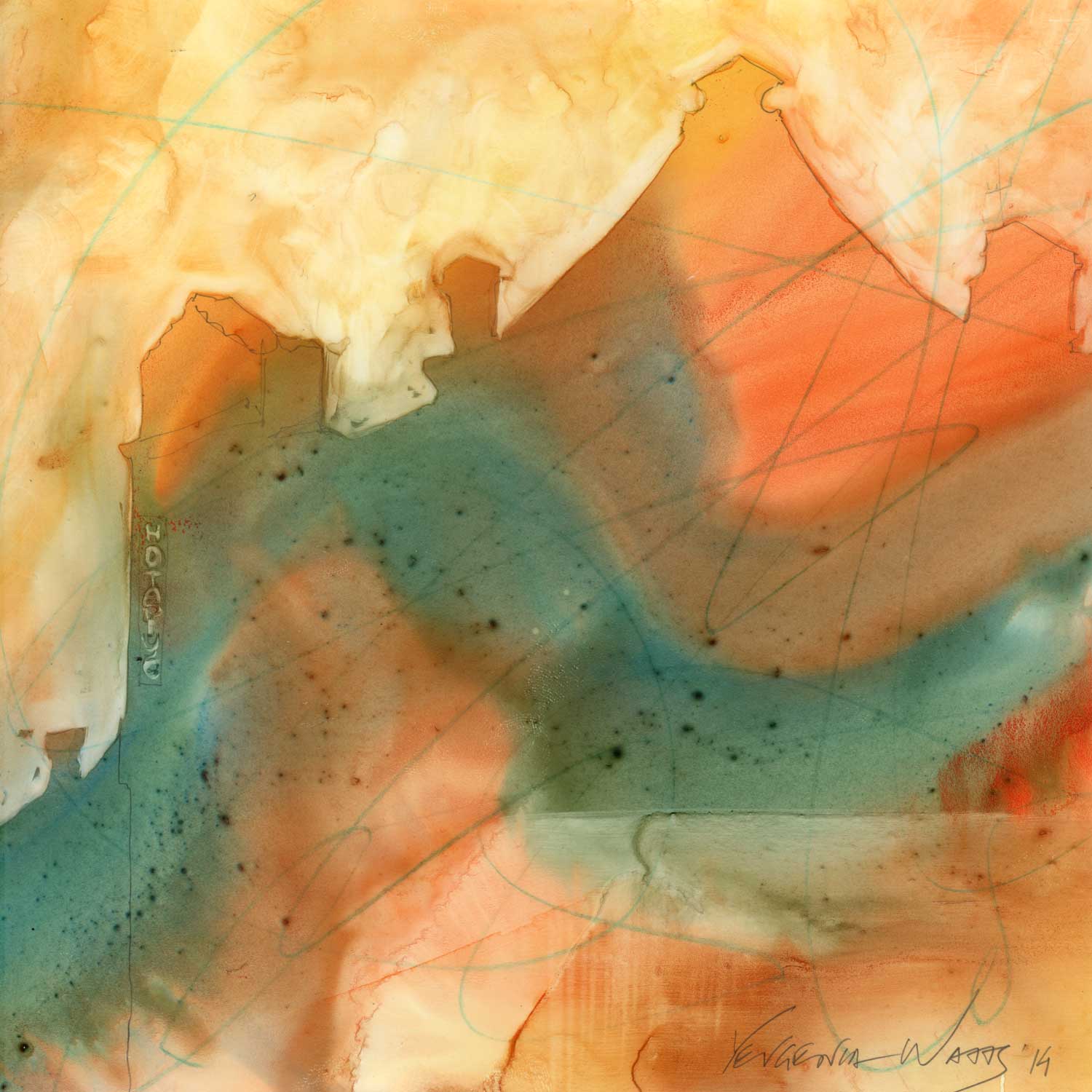
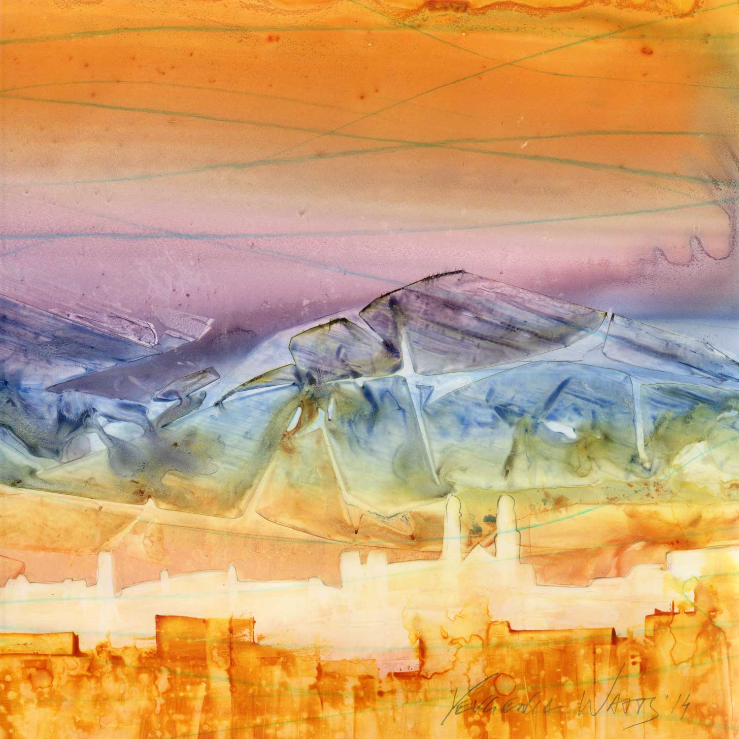
Whatever it is, these paintings haunt me now. Here is Kharkiv, somber and tall. Dnipro, with a red open wound, Lviv, aged and tired of caring for those sheltering in its beautiful architecture. Kyiv, the Golden Gate still miraculously intact.
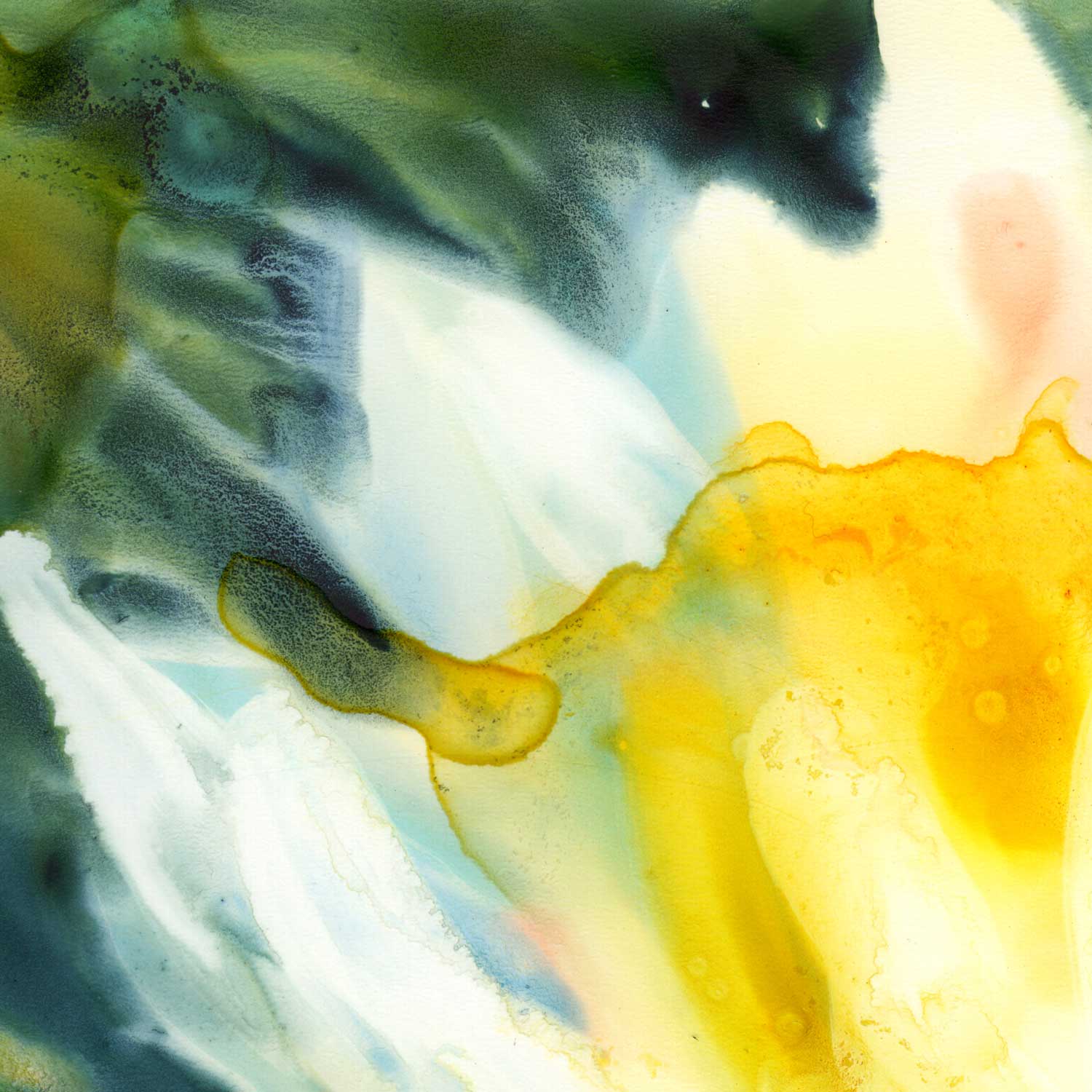
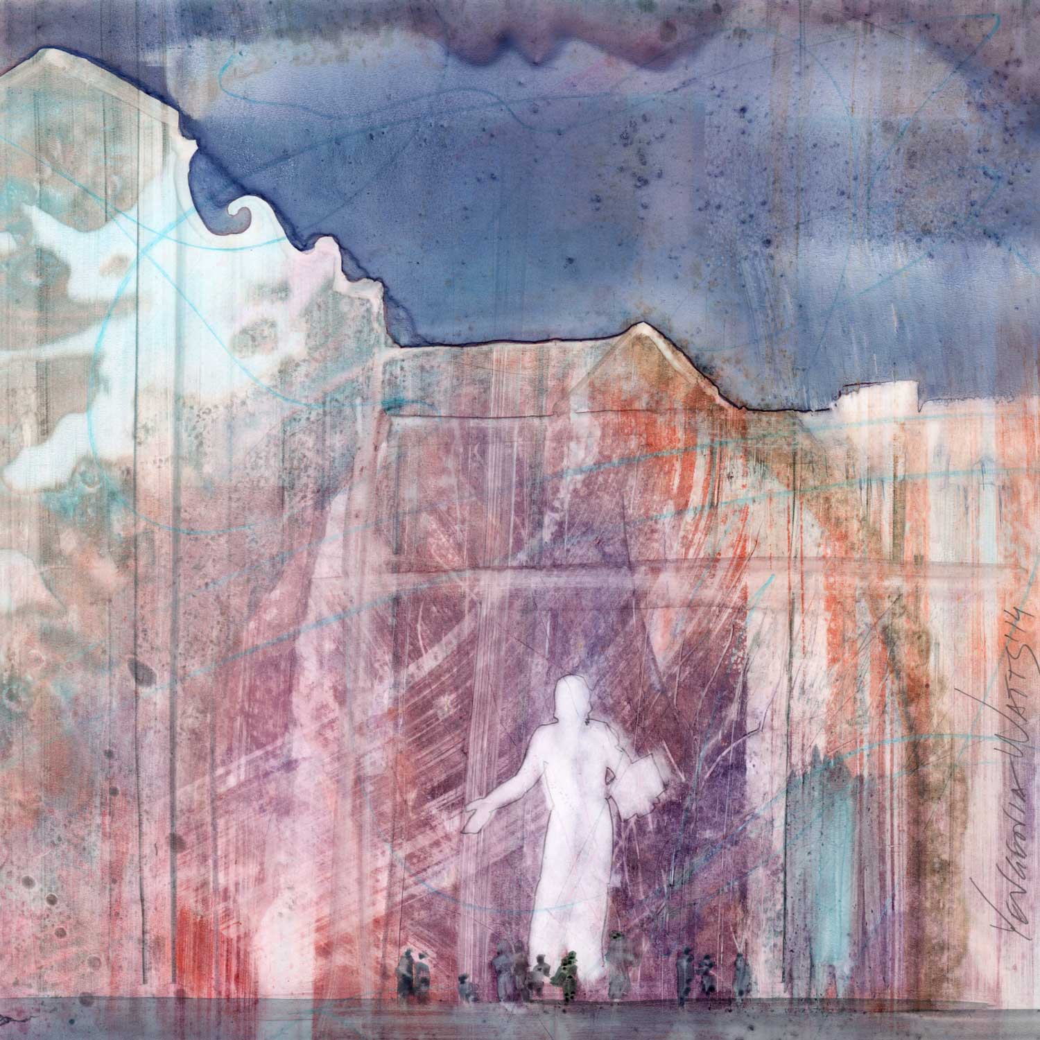
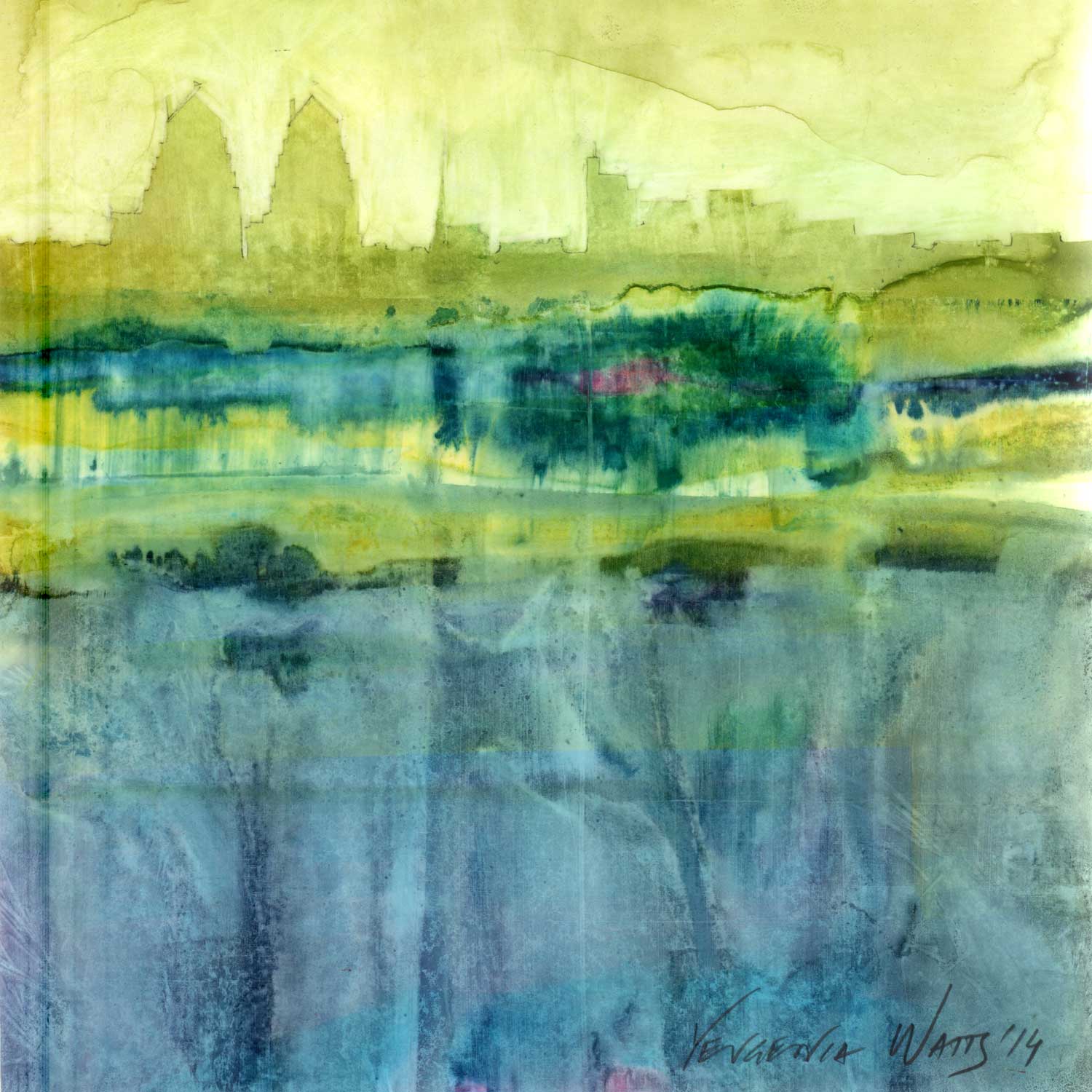
Unity - Dnipro

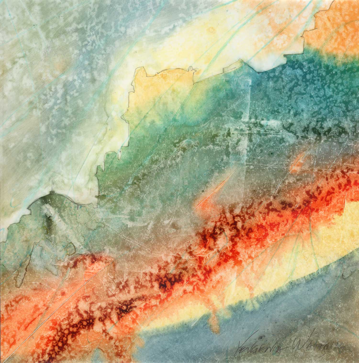
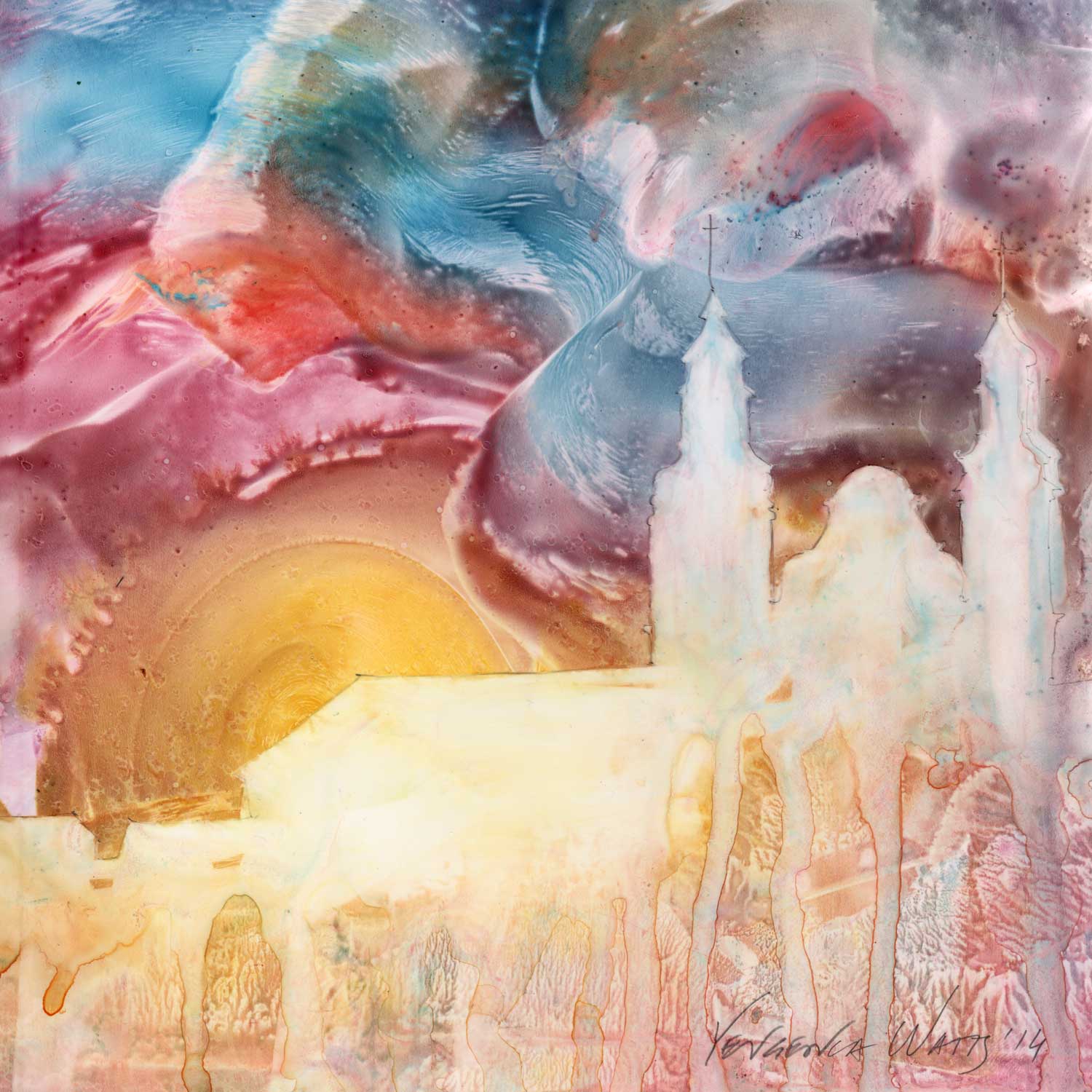
The art technique I came up with and used on this series also feels non-accidental. I would first cover the panel (prepared with a special paper) with conte crayon marks, effectively ending the blank page paralysis. Then came the thick layer of intense, juicy watercolor. After it dried (which took a while, since the Yupo paper is essentially plastic), I began the archeological process of uncovering the silhouette of my Ukrainian cities. Parts of the scenes got scraped away to reveal layers of ghostly shapes and atmospheric moodiness. Others have the preserved intensity of the original layer of paint. And some I reworked over and over, removing all of it and adding it back, until the translucent strata spoke of my history the way I wanted it to.
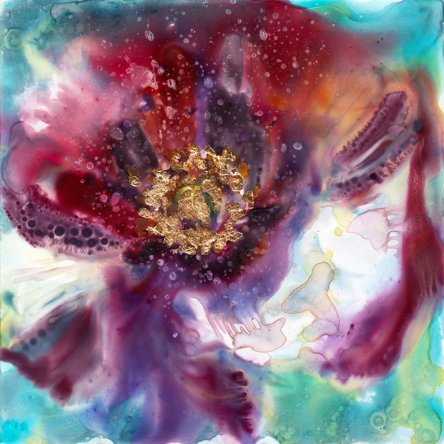
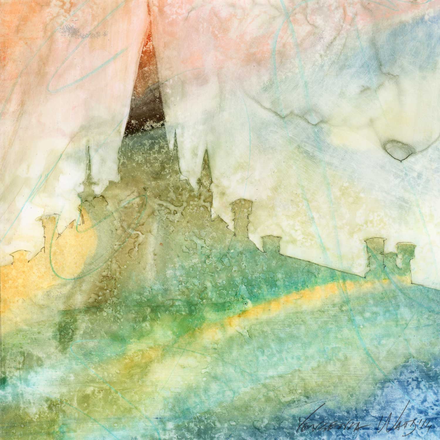
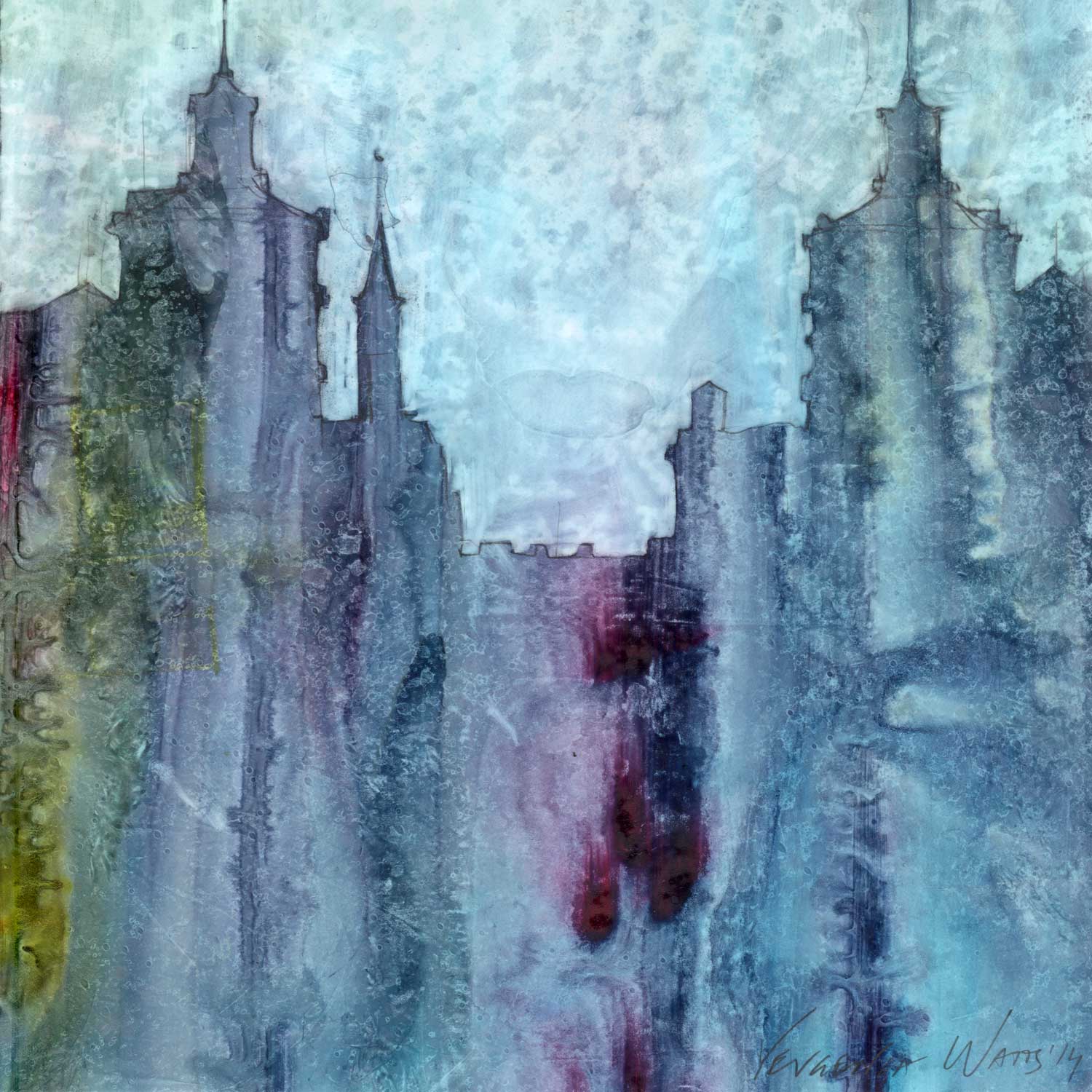
Unity - Lviv

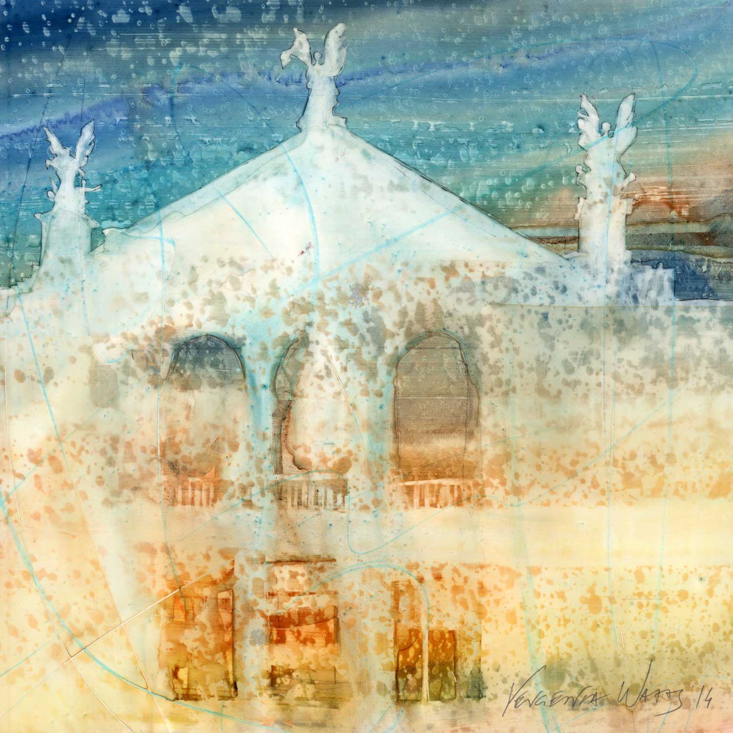
I haven’t been to all of of these places. Some of the reference images came from my friends and family, some from historic postcards, some from internet strangers. And yet, all of them felt…native to me. The architecture, from the cold Soviet neoclassicism to copper-roofed Ukrainian Baroque, is all mine. It is the architecture of these cities that inspired me to become an artist, and then a passionate architect.
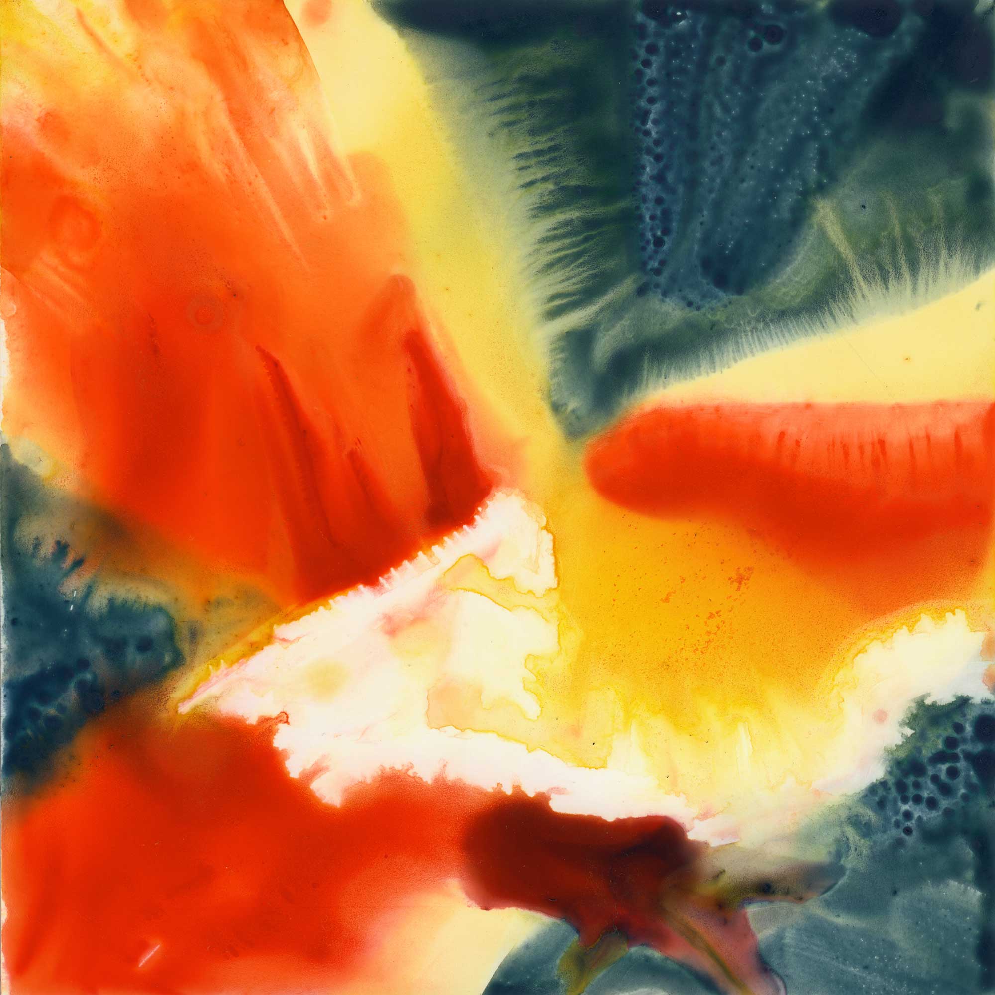
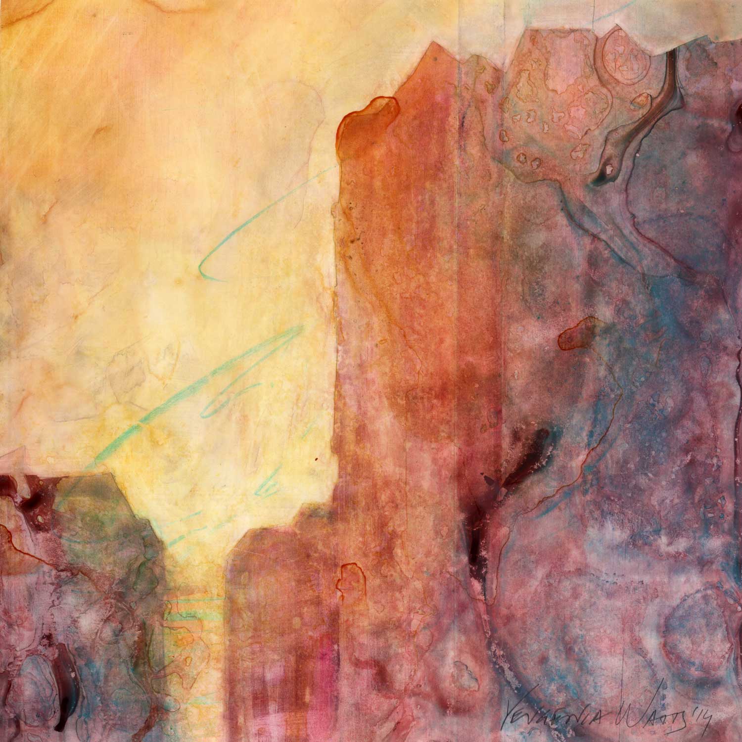
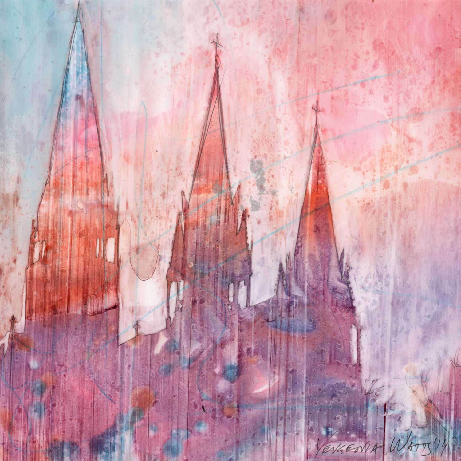
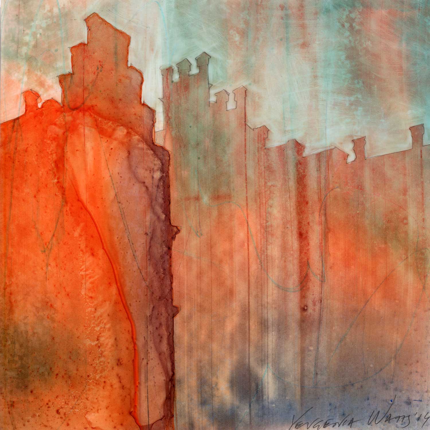
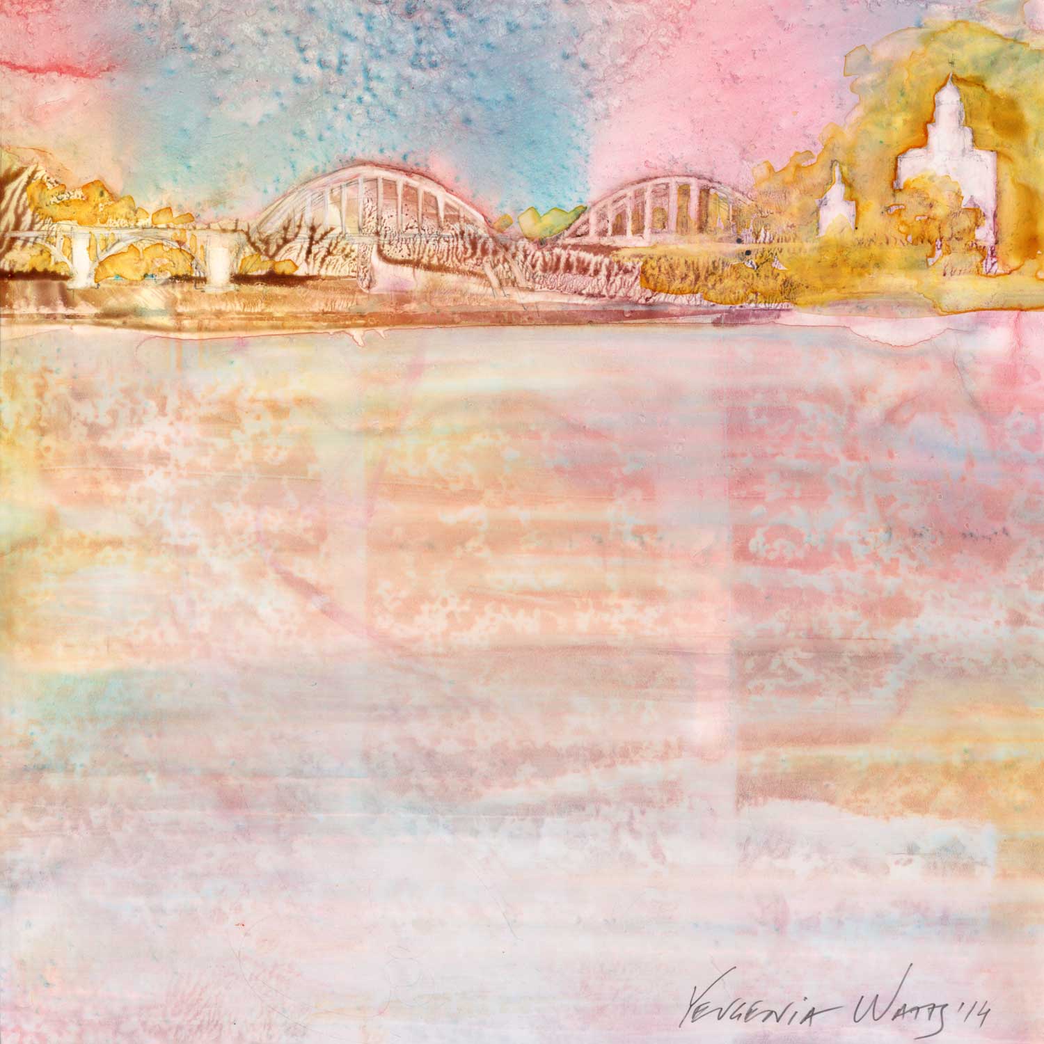
Unity - Khotyn

And every time a Russian missile destroys a Ukrainian building, a part of my heart breaks.

Into Light

Today, yet another variation on the tulip tree theme. The technique in this one was:

1. Wet the whole surface (even though, because it is yupo, it doesn't stay uniformly wet. Water pools in some areas and leaves others practically dry).

2. Apply liberal amounts of watercolor paint. Here, I used quinacridone red, cobalt turquoise, quinacridone gold, and phtalo blue (See more information on the colors on my palette here).

3. Wipe most of the wet paint away with a "thirsty" brush. 

"Into Light." 6x6" watercolor on Yupo mounted on board. Click on the image to learn more.

"Into Light." 6x6" watercolor on Yupo mounted on board. Click on the image to learn more.

What's a "thirsty" brush, you ask? It's any brush you want, but it has to be:

1. Dipped in water and

2. Squeezed out, either using your fingers, a rag or a paper towel. 

Basically, it's a brush that is not dry, but is primed with water. It is perfect for picking up the paint you might not want on your painting. I like to use round brush for that but any shape you prefer is fine, too.

The closeup above shows how much paint there was initially. This is a spot which I left alone after putting paint down.

Closeup below: areas where I wiped the paint off still have ghosted traces of the colors that were applied. I really like this effect in Yupo.

Water Lily, a quick lesson in color and values.

This one is quite possible one of the more restrained color palettes I've ever used in a painting. I am typically drawn to complementary color schemes, in one way or another. Here, everything is, well, analogous.

(Quick Color Theory 101: complementary colors are those you find directly opposite each other on the color wheel. Analogous colors are neighbors on the color wheel).

"Water Lily." 6x6" watercolor on Yupo mounted on board. Click the image to find out more.

"Water Lily." 6x6" watercolor on Yupo mounted on board. Click the image to find out more.

Most of the weight in this little painting is being carried by value contrast. The white of the flower, interrupted only here and there by subtle echoes of the background colors, is the main character. It is clearly in the spotlight.

(Quick Values 101: "Value" in a painting has to do with how light or dark a shape is. Value contrast happens when there is a big difference in lightness/darkness of adjacent shapes: light shape on dark background or dark shape on light background are two clear instances of value contrast).

Here's this painting in black and white:

Removing color makes it a lot easier to see what is light and what is dark. Ancient technique of underpainting in grayscale or sepia takes advantage of this. We artists tend to get overexcited when we get to play with color and often forget about values.

A couple of details:

My favorite "invasion effect" happening where the petals of the lily meet the dark waters of the background. The yellow area has hard edges by contrast.

My favorite "invasion effect" happening where the petals of the lily meet the dark waters of the background. The yellow area has hard edges by contrast.

Really like this closeup. The white of the paper is shining through the transparent washes.

Really like this closeup. The white of the paper is shining through the transparent washes.

Kindness, a surprise

I can't decide if people in general are good or bad. I typically assume they are inherently good but I am also genuinely surprised when they treat me with kindness. It's a paradox that I'm sure makes perfect sense to a psychologist. Or a philosopher.

Why try to determine their goodness or badness anyway? Why draw the line between the good guys and the bad ones? Is it because you aren't sure which one you are? Maybe that's why children are so interested in figuring this out. Maybe you just need to know on which side of the line you belong.

It is rarely that simple, of course. Lines get blurred, good guys do bad things, bad guys turn out to have a soft side. And yet, somewhere on a very basic level, you choose a side. 

Me, for example. I think I'm a people optimist. 

"Cactus Optimist." 6x6" watercolor on Yupo. Click here to learn more.

"Cactus Optimist." 6x6" watercolor on Yupo. Click here to learn more.

Now, about cacti.

I still remember the first time I saw a spectacular bloom on an evil-looking cactus. I had no idea those things were anything but ugly and dangerous. I saw it while walking past a neighbor's front yard and I had to stop and just stare at it. It was beautiful, it had a tender pinkish color and it was surrounded by buds that promised even more gorgeousness in the next several days. They stayed blooming for weeks. 

Sure, it was the same ugly untouchable cactus after its blooming season was over but ever since then, I paid a second of attention to it when I passed it. This bad guy had a secret, and it was a good one. I became a cactus optimist.

But hey, cacti are easy. People though...people surprise me with kindness. Does that mean I actually believe they are mean? Or perhaps it is my beliefs about myself that is muddling the water here...Do I secretly believe that I am not worth a kindness?

Hmm...Psychologist, like I said. I need one :)


P.S. This painting is actually a variation on a theme: here's the same thing six years ago.

Decadence, or too much of a good thing

Here's a curious thing: my mind firmly associates the word "decadence" with delicious dark chocolate and lava cakes. Variations of word "indulge" and "crave" usually accompany these visions. Thanks, people who write marketing copy and create ads.

From Merriam - Webster online dictionary:

Decadent adjective dec·a·dent \ˈde-kə-dənt also di-ˈkā-\

  1.  :  marked by decay or decline

  2. :  of, relating to, or having the characteristics of the decadents

  3. :  characterized by or appealing to self-indulgence <decadent pleasures>

"Decadence," 6x6" watercolor and metal leaf on Yupo mounted on board. Click the image to learn more.

"Decadence," 6x6" watercolor and metal leaf on Yupo mounted on board. Click the image to learn more.

So...why am talking about decadence anyway? Well, this painting here has a certain rich and deep flavor...An opulence, a chocolatiness. It is like a full-bodied red wine with notes of blackberry that lingers on your tongue. Or an intoxicating sweet aroma of exotic flowers after dark.

It is like reading poetry

slowly,

out loud,

to a lover.

It is so good it must be bad for you. Go ahead now, click on these close-up details. I zoomed in on the most deliciously decadent parts.

Indulge your visual senses, you know you want to ;)

Into Shadows

...And now, back to yupo and the wonderfully luscious color! This painting was based on an impression of tulip tree flowers, with clear blue California spring sky peeking through. We had this beautiful dwarf tulip tree in front of the kitchen window of our previous house. The flowers were a lovely shade of pink but in the shadows, they took on darker, meatier tones. That, and the irregular, unique shapes of the clusters caught my attention.

"Into Shadows." 6x6" watercolor on Yupo mounted on board. Original painting sold. Click here to view print choices.

It's a curious color scheme and an interesting technique. I started very wet, with the breezy blue and luminous yellow and then...did a kind of a watercolor impasto: put the purples and magentas down in a very thick consistency. This produces the "invasion effect" (I just came up with that term), where the areas of greater wetness "invade" the less water-saturated ones.

I reeeeeally like the organic textures this gives me. Yum! And by the way, this technique is a big secret, so...you know, only share it with your best friends :)

In other news, I recently did some printmaking (blog post coming) and I'm looking for a "day job" in architecture. So if you know any architects in Sacramento, please beg them to hire me as an intern :) .

And that's all for now,

Yevgenia

Breathe

This painting is part of a mini-series of abstracted white tulips that was born out of simple, everyday beauty that made me stop breathing for a bit.

I had a bouquet of these flowers for a week or two, and with every passing day, they transformed. From tightly closed buds to shy, one-eyed teasers, to graceful crowns and then, fantastically contorted white birds, until finally, their papery petals fell down.

Their white bodies caught afternoon light and became stark against the shadows, luminous in the light, translucent in the many subtle variations of colors that they reflected. Never before have I been so captivated with white things (hmm...maybe that's what the title of the series should be, "White Things?" Sounds so very contemporary and controversial and all kinds of sociopolitically charged).

'Breathe' watercolor on Yupo mounted on board. 6x6." Click the image to learn more and buy.

'Breathe' watercolor on Yupo mounted on board. 6x6." Click the image to learn more and buy.

I was really taken by these flowers. There wasn't any red in the background but somehow, the intense, passionate red paint seemed to me the one and only choice.

I sometimes worry that painting flowers is not classy. Too obvious, too overused in art, like pretty girls. That there should be more angst and more depth and more message to my art. Because I do have enough angst and depth.

But when you look at something and it touches your heart, without any physical contact, it feeds your hunger for beauty and you forget to breathe - how can you not want to share it? This is, then, the message: I saw this beautiful white thing, it filled me with wonder and happiness. Share it with me :)

Golden Poppy, watercolor on Yupo

Well, unlike many of my online artist friends, I didn't do the January edition of the 30-Paintings-in-30-days challenge (too much on my plate). But I will indulge you in a series of posts with my last series. 30 days is about how long it took me, too!

If you had an opportunity to see these at the Blue Line in Roseville, thank you! If not, sit back and enjoy the luscious, fluid and vibrant paintings just as I did creating them. 

 Watercolor on Yupo synthetic paper mounted on board. 6x6." Click on the image to learn more.


Watercolor on Yupo synthetic paper mounted on board. 6x6." Click on the image to learn more.

This one is a California (Golden) Poppy. I like the level of abstraction I was able to achieve here and I'm still swooning over the yellow paint that spread into the dark areas. 

Golden poppies were an exciting discovery for me 12 years ago, when I moved to Sacramento, California, from Ukraine. I have never seen them before or thought that flowers could have this wonderful, rich orange color. Poppies in Ukraine are red. And they have a different shape. And when they dry up, you can harvest them for poppy seeds or use their seed pods as rattles.

So, anyway, California poppies still feel a bit exotic to me. Even after 12 years. Maybe that's why I painted quite a few this time around. More to follow :)

More gorgeous flowers!

Here's what I've been up to. After a short break from September's 30 paintings in 30 days project, I took up another 30x30 marathon, this time with a show at a local art gallery at the finish line. I continued my theme of flowers on Yupo and refined my process to a point where I became very comfortable with it. I feel like the next step should be growing these florals larger and abstract-er. Maybe sometime soon.

Closeup of a watercolor on Yupo in progress.

It was fun playing with water and paint and fine-tuning this series. I get so dorky-excited when I watch the paint ooze and mix on the surface and create amazing organic textures. It makes me happy every single time :)

Working on this many panels in a short time created some logistical challenges. This last move left me without a studio and I get to be all kinds of creative around the dining room and living area. So, these ledge shelves from Crate & Barrel were my solution to the drying and storage issues. Well, not so much drying, since I usually keep watercolors on Yupo flat until they are dry, but these shelves do keep them all nice and away from forces of nature (like my kids).

I got six of these, three on each side of my dining room window.

And they are great at forcing me to step away and evaluate, hence the fact that some of the paintings above do not exist anymore. Or, rather, exist in a more metaphysical way, underneath something else. This should make the job of x-raying my paintings after I'm dead more interesting :)

Another curious part of this project was mounting it on a 41x41" board (the gallery's idea). I wasn't so sure about it at first but loved how it turned out. If nothing sells, I will welcome the whole panel back with joy. It is beautiful.

The show runs through Jan. 9, 2016 at Blue Line Arts Gallery (405 Vernon Street, Suite 100 Roseville, CA). Reception is on December 19, 7-9 pm.

Stop and smell the (yellow) roses

Things may have gone a little wild here. I had a plan. I covered the whole surface with yellow at first, and went ahead wiping out highlights and adding shadows. Which resulted in a rose-looking yellow flower. But it lacked something. So I added splatter. Wrong move. I scraped some areas. Eeek, even worse. I got frustrated and put the painting away for a while.

When I came back to it, it still looked bad. So I wiped most of the painting off and reworked it completely, with bold brushstrokes and exaggerated color. This is the beauty of a failed painting: it's already bad. You are unlikely to make it worse, and you might just make it better!

And hey, from a few feet away, it does look like a rose :)

Purple Iris, courtesy of Trader Joe's

And I'm back! All better and ready to make some more fabulous art :) The 30-in-30 challenge is about over but I'll give it an honest effort until it is. Today, I have for you a very much abstracted close-up of an iris:

I picked these lovelies up last week at a Trader Joe's, which is currently my favorite place to get flowers. Apparently, this is a "beardless" iris, as opposed to a "bearded" one. The bearded irises are the ones with nice big ruffles. These are more plain and it was actually a bit of a challenge to find an interesting angle and crop - but I am pleased with the way it turned out.

On a whim, or maybe guided by the mysterious internal artist-sense, I added some gold leaf to the focal point.

Purple and gold, after all, are perfect together!

In other news, I recently received an Honorable Mention in the Watercolor Artists of Sacramento annual show (judged by Michael Reardon). Pretty happy about that. This is the painting that brought me another ribbon:

Orange Zinnia, third try.

I think this one passes the quality inspection :) Same flower as yesterday, but I decided to go with a completely different view and composition. I like this a lot better.

As I do when I am stuck, I created a couple of thumbnail sketches with composition ideas. They help me think.

There really isn't a good reason to not do them before every painting (other than maybe being completely spontaneous). Each takes a couple of seconds (these are about 1.25" square) but has the potential to give you the clarity you are after.

I liked the bottom right one (which was the last sketch I did) and began the painting with it in mind. And then I turned the flower around and opened it towards the viewer. Nothing wrong with changing your mind :)

8x8" watercolor on Yupo mounted on panel. Click on the image to view more details and buy.

8x8" watercolor on Yupo mounted on panel. Click on the image to view more details and buy.

Speaking of changing minds, I did another Periscope today, painting this. And you can see me changing directions many times throughout the process. I put paint down, and a couple of minutes later, I wipe it off. I believe it's part of the process and it's important to allow yourself the freedom to change your mind. Painting is a form of thinking.

The Periscope replay is available for 24 hours, so until around 1 pm PST tomorrow (I am @YevgeniaWatts on Periscope). I will also include this one, in a high definition video, in my future online class.

Orange Zinnia, this will be.

So here are try #2 (top) and try #1 (bottom), and I'm not happy with it. The central composition that worked well in the Envy Zinnia, doesn't cut it here. I'm also not so keen on the flower and the background taking up roughly the same amount of space. So I'll give it another go later today or tomorrow, with a different composition. It's a good thing you can wipe Yupo (almost) clean.

Orange Zinnia watercolor on Yupo.

Painting on Yupo in progress.

I do feel that there is something in the combination of the dark blue, intense orange, and white/neutral areas. I like it. So the plan is: same color scheme, different composition. Verdict tomorrow :)

Envy Zinnia Watercolor on Yupo

First of all, I had no idea until today what this flower is called. Now I know! This flower that I took from my mom's garden, has a beautiful, indescribable green color. I'm sure there's a name for that, too. I thought it would look good against a dark, deep indigo and blues.

I liked painting this so much that I wanted to jump straight into another painting, when I discovered I don't have any more prepared panels! So that's my project for tonight.

Painting 10! And a bit about Turner

If you are following the 30 Paintings in 30 Days madness going on all over the artist world, you know we are right in the middle of the project (it's day 15). I decided at the very start that I would take the weekends and Labor day off, so I'm on painting 10. Which is still pretty cool! I'm enjoying all these florals, especially the ones on Yupo. The difficult ones, the ones that challenge me to change direction and take chances. The risky ones that bring me the most return.

6x6" Watercolor on Yupo mounted on board. Click on the image to view more details and buy.

6x6" Watercolor on Yupo mounted on board. Click on the image to view more details and buy.

In other news, my birthday is tomorrow (September 16). I am turning the very old and wise age of 34 :D . So, last weekend, in honor of this, and because I've been wanting to since spring, husband took me to San Francisco to see the J.M.W. Turner show at the De Young. It was good. Luminous and atmospheric. And sketching and sticking your nose too close to the painting was forbidden, and photographing was not.

Zinnia

It happens with a curious regularity: I make a bad painting, I wash it off, I make another painting on top. And that, the second, or even third, painting is good. This is one of those. I think it's curious because it proves the point that failure is just a part of the creative process. An integral part, at that. Would I have arrived at this image if there were not another, failed one, underneath it?

Zinnia. 6x6" Watercolor on Yupo mounted on board. Click on the image to view more details and buy.

Zinnia. 6x6" Watercolor on Yupo mounted on board. Click on the image to view more details and buy.

That's all for now. Maybe I will have time to pontificate more on this topic tomorrow. Meanwhile, I'd love to know what you think. How do you process your creative failures? How do they affect your outcome?

Until then,

Yevgenia

A Splash of Sun! And a painting video

Have you heard of Periscope? If not, here's a summary: it is an odd combination of YouTube and Twitter and who knows what, but it's new and it's picking up speed like crazy. What you do on Periscope is broadcast video live and watch other people's broadcasts.

So this painting I'm posting today was painted during my first Periscope broadcast, a recording of which you can now see on YouTube:

I intend to do more broadcasts like these once in a while, so if you'd like to catch it live next time, follow me on Periscope (@YevgeniaWatts). One neat thing about watching a live periscope is that you can ask questions, and I can, hopefully, see them and answer them in real time.

This is the result:

Available here.

Fire Made With Water

It is curious how very wet these paintings are when I work on them and how, despite that, they evoke a feeling of moving fire. It must be the organic, free-flowing nature of the opposite elements that unites them. I think it's fascinating.

This is the new painting I have for you for today. It is another 6x6" Yupo mounted on panel. Here's a picture with my hands for scale:

It is available here.

My 3.5 year old daughter was around when I was painting these and she likes to paint, too. She also happened to watch an educational cartoon about Degas and pointillism that morning, so she wanted to do a pointillism flower painting. Here it goes:

Love it. She is currently my artist mentor :)

There will be another Yupo sunflower tomorrow...sorry, can't help myself! :) Yupo and sunflowers go exceptionally well together (here's a larger and older Yupo sunflower painting, available as print). I will also have a link to a Periscope video recording of me painting tomorrow's painting, don't miss it!

Note: I will be publishing a new blog post every weekday for the month of September. If you receive my posts via email and do not want to get them every day, update your subscription preferences to a once-a-week digest (link on the bottom).

And now, to Yupo! And Sunflowers!

You know it was only a matter of time before I go back to sunflowers. They must be my most paintable flowers. They inspire me every time.

And, like I promised at the beginning of this challenge, I am painting on Yupo. I like having it mounted on a panel, so that's what I'm doing. For an excellent tutorial on how to mount any paper on board using double-tack film, go here.

After these are varnished, they don't need a mat, a piece of glass, or even a frame. Here's what this painting looks like just sitting pretty on an easel:

Or even propped up on a book shelf:

See more of my available flower paintings here. Not ready to buy an original? Check out the prints here.

I am also recording the process of most of these flower paintings, with the idea of releasing it later as the material for an online course. If you are interested in my future course offerings, please make sure you are signed up for my updates (below).

Day 7 - more Yupo!

Another busy day today. I had my last class of an Intro to Watercolor course, which was a little bit sad. This has been one of my favorite groups of students so far: interested, committed, talented, and hard-working. An excellent combination for any new thing to learn, but watercolor especially. I loved working with them and hope to see them back for more in the future :)

6x6" Watercolor and Nupastel on Yupo. 

My daily painting today is actually a little demo I did in class, just showing different stuff you can do with Yupo. It's not a finished painting but I like it so far and I may work on it some more (at some obscure later date...hmm...let's not go into details here).  

Tomorrow, I plan on driving to the UC Riverside Botanic Gardens for a paintout. So it should be a good productive morning, or at least an interesting one.