art tips

Are you an artist?

There is a threshold, or maybe a small speed bump, that we must cross when we are about to change our identity or add another one to the deck of identities we already have. This threshold involves a “coming out” to others. We do it by calling ourselves this new name, awkwardly and gingerly at first, until it feels natural.

And this public proclamation to others, this voice we are giving to something that grew silently until now, is also a “coming out” to ourselves. We try it on for size, we play with it, we wonder why we haven’t done it earlier. Because we’ve already had this identity within us for a long time but were afraid to claim it.

Becoming an artist is exactly like this.

It may take someone seeing your work, something you call “dabbling” or “doodling” to avoid judgement, and telling you that they like it. Do you show it anywhere? Can I buy it? Can you make one for me?

Or it could be you getting a community center art class as a gift on your birthday and wanting more after it’s over. Or finding your high school drawings in a long-forgotten file and feeling a longing to make art again.

I remember my speed bump moment well.

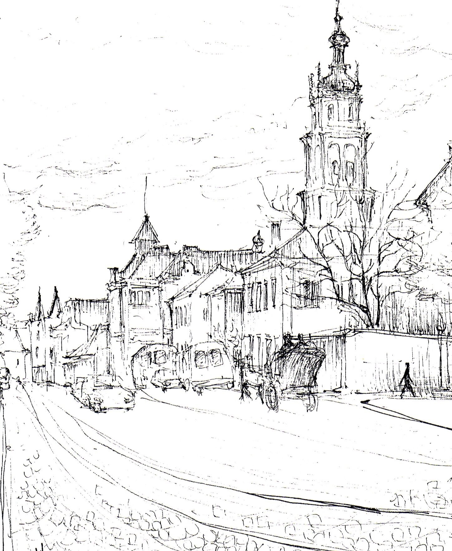
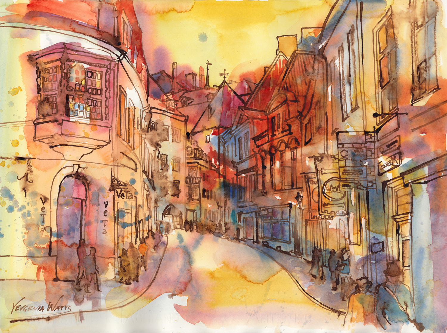
Sketch of a street in Lviv

Sketch of a street in Lviv

I’ve always been making art in some form or another, and my parents recognized this interest early and enrolled me in all kinds of art workshops and schools since I was 8 or 9. This was my after-school activity of choice. I was also okay in choir, half-decent on piano, miserably bad on violin, D- in theater arts, and immediately bored with any kind of sports.

So, art it was. When the end of high school came around, it became clear to me that “artist” was not a career choice. Professional artists, so it was rumored, did exist, but I’ve never met one until, ironically, I was getting lessons in preparation for architecture school entrance exams. You could see their work in museums but they were like these mythical creatures that lived somewhere in their secret studios, hidden from the turmoil of daily life and separate from the rest of us.

I realize that this perception was probably uniquely Eastern European. Back in the U.S.S.R., artists were subsidized by the government and were free to create…as long as this creation promoted the message of the Communist Party. They didn’t need to make money. I guess they were a kind of an affiliate occupation to the politicians.

But, it’s high school, and my classmates are choosing majors and universities left right and center, and I am spending my summers on job sites with my tile contractor dad. What’s it going to be?

I accidentally stumble on a set of drawings for a store remodel at one of the job sites - and the gears in my brain suddenly align with a click. School is easy and I like drawing stuff. I can do this!

I’ve never met an architect before.

A first year fantasy art project

A first year fantasy art project

I go on to enter architecture school in Odessa and study there with mixed success for three years. Mixed, because I love exploring possibilities and hate getting half-baked projects done on time. I overthink.

And my favorite classes are studio art. I develop mad watercolor skills and get top marks. I’m also really good at math. And skipping classes I don’t like.

In my third year, my family moves to the U.S., and the clock re-sets. After settling in, I get back into school and take a community college watercolor class for fun. The teacher, himself an established studio artist, tells me that if architecture doesn’t work out, I could always be an artist.

I brush it off.

A portrait of a classmate from Odessa

A portrait of a classmate from Odessa

Eventually, I do finish architecture school (by some miracle, because I have not learned to stop thinking and start doing by then). I graduate at the front end of the Great Recession and I can’t land a job in architecture. It’s not happening.

I take a retail job I am completely overqualified for and sign up for another watercolor class. Again, the teacher wonders out loud what exactly I am doing in this class. I should be teaching it.

But I do not yet call myself an artist. I “dabble” and “doodle”. It’s a form of stress relief, something I turn to in times of uncertainty when things aren’t going the way I planned them to. It’s an outlet for angst and depression.

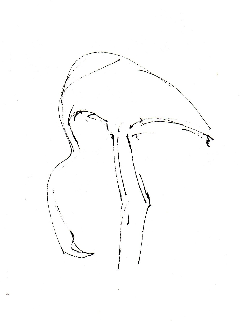
Flamingo at the Sacramento Zoo

Flamingo at the Sacramento Zoo

And one day, my then-husband comes home and tells me that someone at his work saw one of my drawings and became interested in my work. Oh huh. They want to see what else I got.

About the same time, I enter my first ever group show.

The co-worker buys one of my paintings and pays me to get it framed. The frame is more expensive than what I charge for the painting.

But now, I begin trying the artist identity on. I practice in my head: “I’m an artist.” I don’t come back to the retail job after having my first child, and I start a blog talking about my art process. I enter more and more shows and make more and more art. Finally, I call myself an artist.

The Paper Bags, the first painting I ever sold.

The Paper Bags, the first painting I ever sold.

It takes a while to feel natural. The imposter syndrome loves creative people, thanks to the gap between what we know to be “good art” and what we produce. But eventually, with enough sales and validation from others, I claim the title for good.

I’m an artist.

It is now part of my identity, along with “mom”, “daughter”, “architect”, and soon, “wife.” I don’t give it a second thought or skip a beat when I say I’m an artist. And the truth is, I could have claimed that title long before I did. It was clear to everyone around me that I was an artist, but it took a while to convince the toughest audience - myself.

I will finish with another quote from Seth Godin:

“Are you an artist? Of course you are.

Artists make change happen. Artists are humans who do generous work that might not work. Artists aren’t limited to paint or museums.

You are an artist as soon as you announce you are.”
How learning watercolor is like learning guitar

I recently began taking an evening guitar class. I signed up on a whim, though I've always wanted to know how to play guitar. As the start date got closer and closer, I thought about cancelling. I felt apprehensive about doing something I was a newbie at, in a room full of people who must have been better than me. I worried about not being good at it. I didn't want to look like an idiot!

Quick sketch from a Renaissance Faire.

Fast forward several weeks, and I can sort of play a song, and I know what a key is and how to use a capo. This is light years away from where I started!

Why am I telling you this? Well, I couldn't help but think that learning guitar is very much like learning watercolor. It felt awkward to be a student and it gave me such appreciation and compassion for those of you who are trying to learn any new skill, and the tricky art of watercolor painting in particular. It's hard. It takes courage and persistence

So here are some morsels of wisdom to help you through a painting class or your own practice:

1. Don't expect a masterpiece.

Seriously. If you're taking your first couple of classes, be kind to yourself and lower your expectations. You will learn amazing things and have beautiful ah-ha moments but you won't paint like your instructor just yet.

2. Practice a lot.

This is the one thing that will make you better. And it also the one true barometer of your passion for this new thing you're learning. 

Another sketch from the same Renaissance Faire. I recorded a bit of it, see here.

3. Keep doing it even when you are bad at it.

Everyone gets discouraged when what they are doing doesn't turn out well. My guitar sessions would drive me crazy if I were an outside observer. They do not sound like I know what I'm doing (I don't) or the way you imagine a talented friend softly strumming while you are relaxing to the soothing sounds. Same thing with painting. Most of what you're doing at first looks bad. You don't have to show it to anyone but you have to keep doing it.

This one is an earlier sketch. I cringe when I look at the linework here. The 'hairiness" of the line often comes from hesitation and fear of making a mistake, and then you inevitably make a mistake, and then you try to correct it. Which, overall, ends up looking bad. The solution is accepting your mistakes and letting them be. Which translates into confidence, which looks like a nice, clean line. Theoretically speaking ;)

4. Embrace discomfort.

I am a proud owner of three left fingertip calluses, and a developing pinky callus. Those are achieved by pressing the strings against the fret (which, while your fingertips are still soft and sensitive, hurts). When it comes to learning watercolor, the discomfort is mostly in your head. Any progress, however, demands that you get uncomfortable. Are you used to coloring within the lines? Let the paint bleed all over them. Are you scared of painting wet-into-wet? Bite the bullet and do it at your next painting session.


Into Light

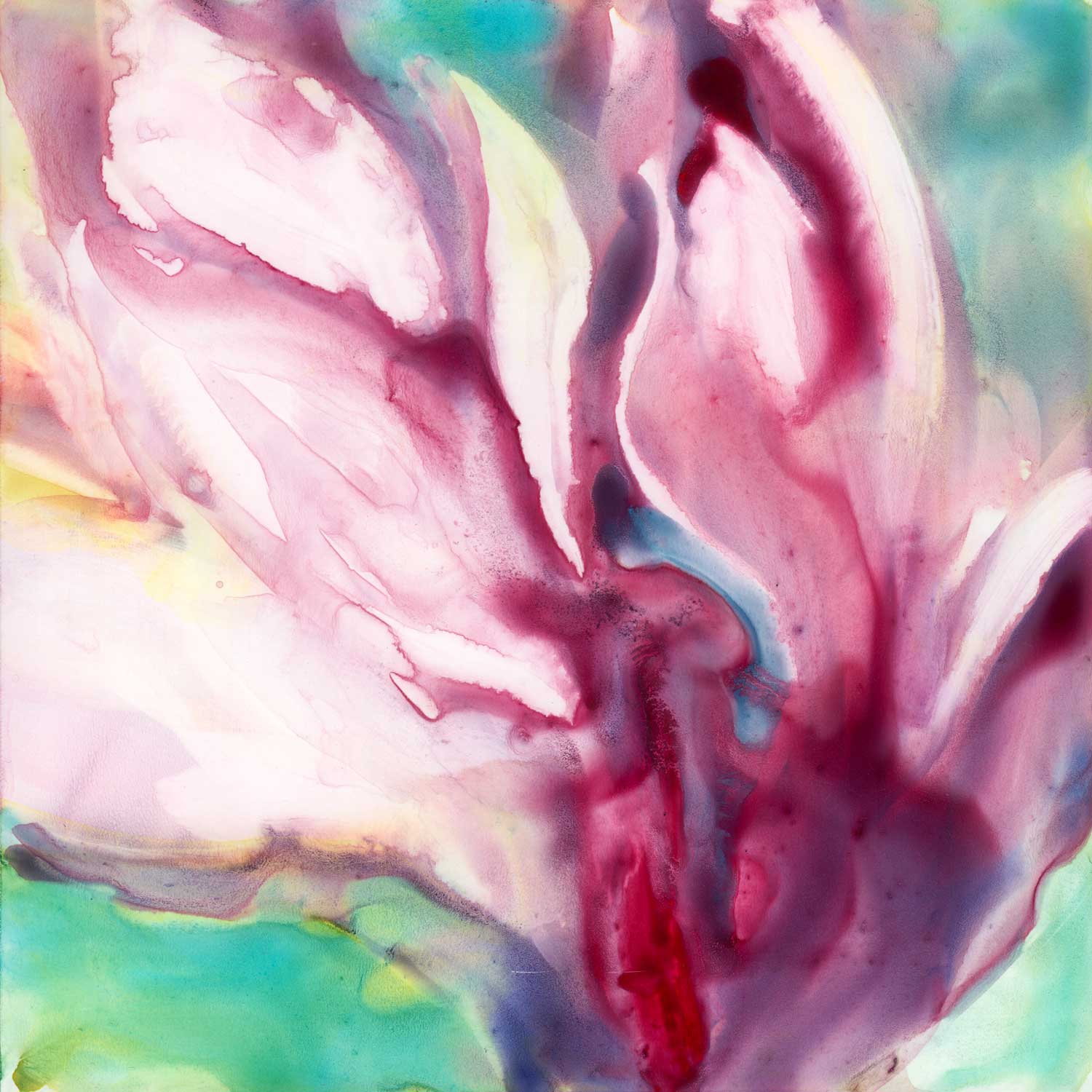
Today, yet another variation on the tulip tree theme. The technique in this one was:

1. Wet the whole surface (even though, because it is yupo, it doesn't stay uniformly wet. Water pools in some areas and leaves others practically dry).

2. Apply liberal amounts of watercolor paint. Here, I used quinacridone red, cobalt turquoise, quinacridone gold, and phtalo blue (See more information on the colors on my palette here).

3. Wipe most of the wet paint away with a "thirsty" brush. 

"Into Light." 6x6" watercolor on Yupo mounted on board. Click on the image to learn more.

"Into Light." 6x6" watercolor on Yupo mounted on board. Click on the image to learn more.

What's a "thirsty" brush, you ask? It's any brush you want, but it has to be:

1. Dipped in water and

2. Squeezed out, either using your fingers, a rag or a paper towel. 

Basically, it's a brush that is not dry, but is primed with water. It is perfect for picking up the paint you might not want on your painting. I like to use round brush for that but any shape you prefer is fine, too.

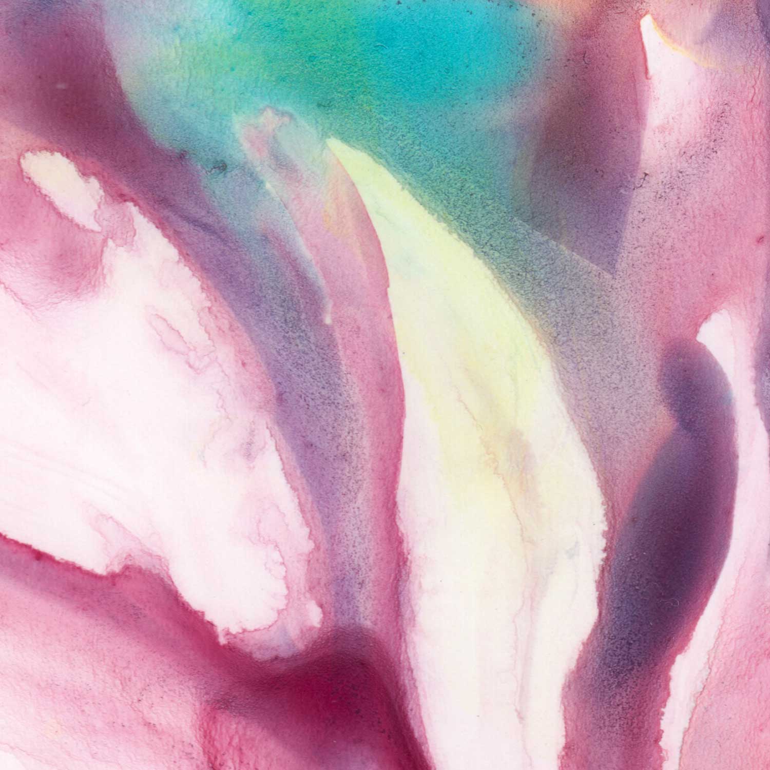
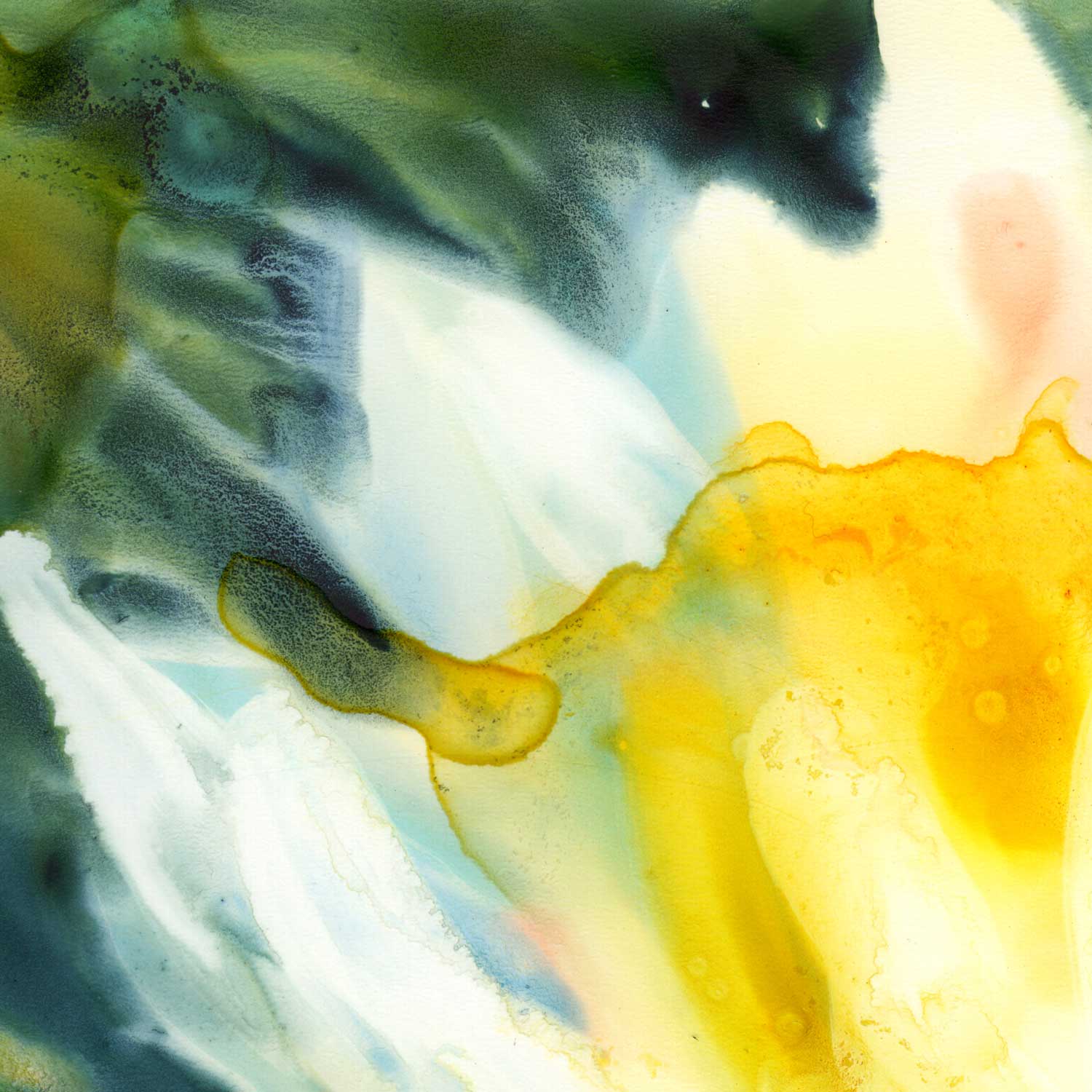
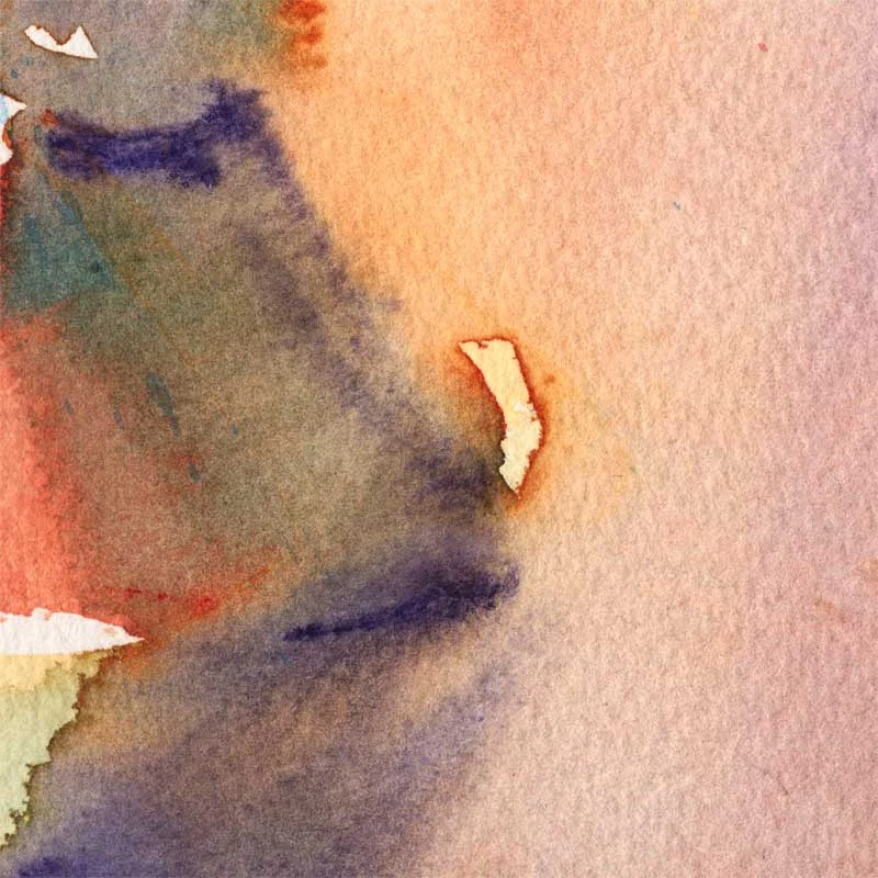
The closeup above shows how much paint there was initially. This is a spot which I left alone after putting paint down.

Closeup below: areas where I wiped the paint off still have ghosted traces of the colors that were applied. I really like this effect in Yupo.

Water Lily, a quick lesson in color and values.

This one is quite possible one of the more restrained color palettes I've ever used in a painting. I am typically drawn to complementary color schemes, in one way or another. Here, everything is, well, analogous.

(Quick Color Theory 101: complementary colors are those you find directly opposite each other on the color wheel. Analogous colors are neighbors on the color wheel).

"Water Lily." 6x6" watercolor on Yupo mounted on board. Click the image to find out more.

"Water Lily." 6x6" watercolor on Yupo mounted on board. Click the image to find out more.

Most of the weight in this little painting is being carried by value contrast. The white of the flower, interrupted only here and there by subtle echoes of the background colors, is the main character. It is clearly in the spotlight.

(Quick Values 101: "Value" in a painting has to do with how light or dark a shape is. Value contrast happens when there is a big difference in lightness/darkness of adjacent shapes: light shape on dark background or dark shape on light background are two clear instances of value contrast).

Here's this painting in black and white:

Removing color makes it a lot easier to see what is light and what is dark. Ancient technique of underpainting in grayscale or sepia takes advantage of this. We artists tend to get overexcited when we get to play with color and often forget about values.

A couple of details:

My favorite "invasion effect" happening where the petals of the lily meet the dark waters of the background. The yellow area has hard edges by contrast.

My favorite "invasion effect" happening where the petals of the lily meet the dark waters of the background. The yellow area has hard edges by contrast.

Really like this closeup. The white of the paper is shining through the transparent washes.

Really like this closeup. The white of the paper is shining through the transparent washes.

Tallinn (Estonia) - June Virtual Paintout

Happy Independence Day, comrades :) Hope you are having a fabulous weekend. Mine is going fine so far. I am finally experiencing a cautious return of art-making mojo, which I welcome with open arms. Making art makes me happy.

I haven't done a Virtual Paintout since last January, so this is extra special!

Tallinn. 15x22" Watercolor and walnut ink on hot press paper. Click on the image to buy.

Tallinn. 15x22" Watercolor and walnut ink on hot press paper. Click on the image to buy.

The process in this one is a bit backward: I started with a loose watercolor wash...

...and only after it was dry, added the drawing in walnut ink.

In case you are wondering, there was no pencil drawing. True, it's a risky business jumping straight into ink but it also has some advantages:

  • it keeps you a little looser, which makes your lines more fun

Ummm....that's all I can come up with :) My head is running slower than usual right now, what with fireworks well into the night, kids awake on and off, and me finally getting up at 6 am. I don't think I've had a reliable night of sleep since I was pregnant with kid #1. That makes it six years!

I received several questions about this painting, after posting it on my social media (are we connected? Check the icons under my beautiful face on the top right if you're reading this on my website). I will answer what I remember here.

1. Why walnut ink?

I like it for several reasons. The color is one, it looks less harsh than black India ink. I also really like the consistency and flow - it is very...liquid. What I mean is it seems like this ink will not clog the tiniest of the nibs. It's like colored water. And it's not waterproof when dry, it is very responsive to water. This can be a negative but I find it fun. Compare the figures in the image above with the finished painting. All it took is a bit of water-splashing.

2. Where can I get some?

Tom Norton Walnut Ink

Check your art store. I bought my first bottle from Daniel Smith (online) and the one I use now (Tom Norton), at a Utrecht (now Blick) here in Sacramento.

3. What is that thing you used to apply ink?

That thing is a bamboo quill (aka reed pen). It produces a somewhat uneven line and I do have less control but I'm okay with it :) . I picked mine up, on a whim, at the Utrecht store. Yasutomo makes a variety of sizes and there are endless other options, including making one yourself! I'm considering investing in a couple of these  >


Do you let your watercolor paint dry on the palette?

Or do you use fresh paint every time? Someone asked me that on my Facebook page and I thought it warranted a blog post :) . In general, I like to have freshly squeezed paint, especially for direct painting (as opposed to glazing, also known as working in layers). But it is not always practical to use fresh paint for every single painting session. So I compromise. I keep some paint in the palette wells but I don't fill them up completely (even though that usually makes the palette look better). I then add the colors I'm running out of before I paint. Or right in the middle of painting...that also happens.

So, why would you not want to just fill up the palette wells and not have to add more paint as often? Here are my reasons:

  • Fresh paint is just that, fresh. It is ready to go the second you squeeze it out of the tube. It is pure, brilliant pigment uncontaminated by the neighboring color or that sneaky phtalo blue that just likes to invade the whole palette.
  • Some watercolor paints tend to crumble when allowed to dry. It is possible to re-wet and reactivate them but they can become an annoyance when you have to deal with stray lumps of pigment right where you would want a nice uniform wash. Dropping some gum arabic into the pile of paint is supposed to help with that but I don't think it's worth the hassle.
  • Digging dry paint out of the well requires you to rub it with your brush to "break it up", which can be damaging to the delicate brush hairs (do not do it with your kolinsky sable brush). This is how round brushes lose their points. One way to go around it is to use a stiffer, cheaper, synthetic brush for just that purpose - to re-activate dry paint. Once you have a nice puddle going, you can pick the paint up with your painting brush and paint.
  • As I am moving towards larger work or working in series on several small paintings at the same time, I find it easier and faster to cover the surface with fresh paint rather than to try to pick up enough dried paint from the well. With Yupo, I often squeeze the paint directly onto the paper and then add water and mix it there.

Of course, there are some advantages to using dried-out paint:

  • It is probably a little bit more economical. 
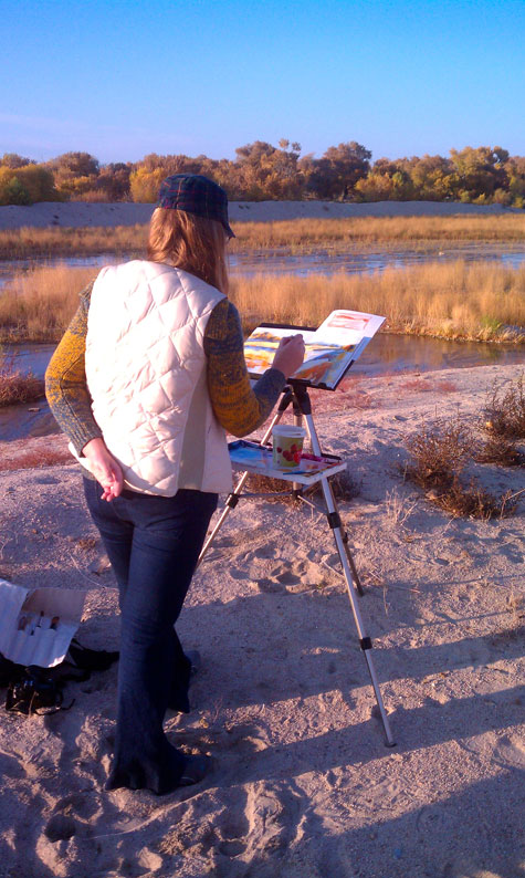
  • I find that it suits better for plein air and for painting outside of my usual studio work. Fresh paint tends to run and leak in transport, while dried paint, even when re-activated, seems to be more stable and less messy. I usually refill my palette wells the night before I go. This also means you don't need to bring the tubes with you.
  • If you work small, you may not need a lot of pigment at a time. Picking it up from the dried pile in the well will give you more control than a freshly squeezed blob of paint.
  • Depending on how you use your paints, there may be not much difference at all between using it fresh or dry. Misting the dry paint with spray or mist bottle 15 minutes before you paint will soften the watercolors and make them ready to go.

Ultimately, it's what works for you. There is no right or wrong answer. How about you? Do you work with fresh paint exclusively or do you prefer to have a full palette of dried paint?

What's on My Palette?

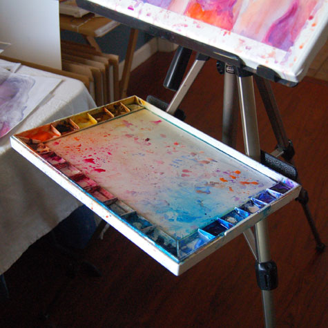
So glad you asked :)! My watercolor palette is a perpetual work-in-progress and I think it will be fun reviewing it once in a while. As of today, this is what it looks like:

It's a John Pike's palette and I'm quite happy with the number of wells, their size, and the ample mixing area. I rarely use the lid for mixing.  

Click on the image to view John Pike's palette on Amazon.com

Okay, the interesting part. Colors, from left to right: 

(Colors in bold larger font are ones I use most. The links are affiliate links and will take you to DickBlick.com. If you buy something, I will get a small percentage for sending you their way. Thanks in advance!) 

Blick Dioxazine Violet.


I put it in there more out of habit than out of need. I pretty much never touch it anymore, but dixazine purple used to always come with my St Petersburg pan watercolors, so I've used it for years.

Winsor & Newton Cobalt Blue.

I use it when I want a slightly lighter and more opaque version ofFrench Ultramarine.  

Winsor & Newton French Ultramarine.

The paint I should probably buy by the bucket. In the absence of buckets, I get the largest tube available (37 ml). And it gets used all the time.  

Utrecht Cobalt Turquoise.

One of those random colors I have and occasionally use. Makes a very delicate violet color when mixed with Quinacridone Red.

Blick Phthalo Blue.

I have a complicated relationship with this one. I love it for giving me nice, transparent darks and brilliant greens, but I hate it for not drying fast enough on the palette and invading every single color while I'm on the move and the palette is not just sitting on a flat surface. It's also a bit of a pain to clean up and it's a staining color (so, don't put it where you think you might need to lift paint later). I am considering either keeping it in a separate container or just bringing a tube when I need it.

Holbein Verditer Blue.

Used occasionally. A semi-opaque, easy-on-the-eye color. Thanks to Tom Schaller for introducing me to this one.  The well next to it holds the remains of American Journey Manganese Blue, which turned out to be kind of dull and very crumbly. Not at all the same thing as Winsor & Newton Manganese Blue.

Daniel Smith Blue Apatite Genuine.

Another random color I use very rarely. Super-granulating, bluish dark gray. I like it, I just don't often paint something that would call for it.


Same goes for

Daniel Smith Indanthrone Blue.

Beautiful, transparent dark blue. Reminds me of writing ink.

Daniel Smith Quinacridone Red .

This is my primary red color. I can warm it up with a yellow or cool it down with a blue. It mixes well with pretty much anything. I tried this color in other brands and it works just as well. Quinacridone Magenta used to be in the well next to this one, but I found it to be a bit redundant. The other well next to it used to hold Daniel Smith Rhodonite Genuine. A pretty color, but it crumbles like crazy when it dries on the palette and I can't say it's essential. I also read somewhere in forums that Rhodonite shifts in color.

Daniel Smith Quinacridone Sienna.

Love it! Apparently, I also need a new tube of it. Again. The color is a nice rusty orange. Transparent, mixes well with most colors on my palette. Not to be confused with DS Quinacridone Burnt Orange, which is actually a rather boring brown.

Maimeri Blu Cadmium Orange.

A basic orange color, semi-opaque. Not used very frequently but is good to have when I need an intense orange. The well next to it is the above-mentioned Daniel Smith Quinacridone Burnt Orange - which is not an orange at all, and I will be scraping it out and throwing it away.

Next one is my primary yellow well.

Currently it's Daniel Smith New Gamboge  but I'm pretty sure there is some Daniel Smith Hansa Yellow on the bottom. Maybe even some Indian Yellow. I'm not very picky there. The blob in the next well is

Maimeri Blu Raw Sienna.

A bit too brown and boring for my taste, so I will be scraping that one out, too. 

Blick Yellow Ochre. 

A good color to have, but not a necessity. Quite opaque and tends to get chalky.

Winsor & Newton Quinacridone Gold.

Another color I buy a lot of. Wonderfully transparent, somewhat greenish yellow. I tried it in other brands, trying to find the same thing but cheaper, and was less than impressed. Winsor & Newton it is.

That's it! I also own a box of St Petersburg (Yarka, White Nights) pan watercolors, with some pans already emptied and refilled with other stuff, for trips and such, when I would not bring my large palette.  

What about you? What are the staples on your palette? 

P.S. For an excellent concise overview of different watercolor brand paints, check out this Wonderstreet article.

How to Make Greeting Cards with Your Art

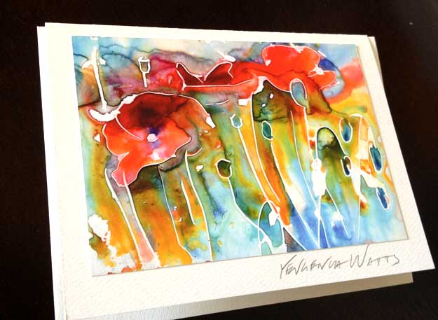
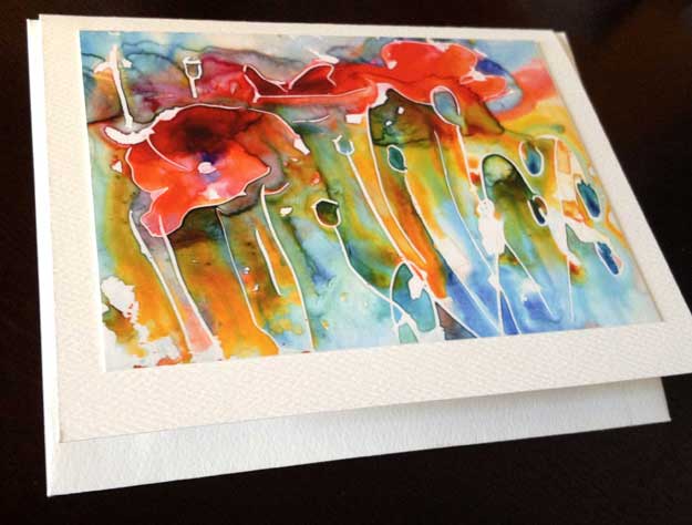
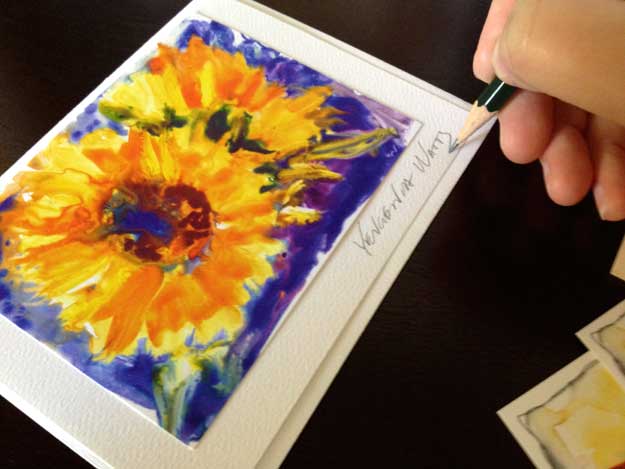
You have many great options when it comes to making cards with your artwork on them. The easiest one is outsourcing the whole process through a print-on-demand website (FineArtAmerica.com, Society6.com, RedBubble.com, Imagekind.com, etc). If you want a larger run of the same image, a printer like VistaPrint is probably your best bet. All of these services will give you a good quality, albeit generic-looking card. Now, what if you want to be a little more personal? I, for example, love having my signature on my cards. It's like a stamp of approval. It's me holding it in my hands, liking what I see, and saying so to my collector (because yes, even those who buy a card from me become my collectors :)). So this is how I do it:

handmade fine art card

1. The print

Let's assume you already have a nice, high-resolution, color-corrected digital image of your artwork. I scan most of mine, photograph those that can't be scanned and then adjust the color using Photoshop.

I use the same printer (Epson Stylus Pro 3880 Color Inkjet Printer) and paper (Epson Ultra Premium Presentation Paper MATTE) that I do for my open edition prints. Probably not the most cost-efficient choice, but the quality of image is superb and I like the fact that these cards are "frameable." I suspect that a regular home office printer capable of printing color photos should be able to do the job. I print the images a bit smaller than the dimensions of the card, so that I have space for the signature and the border.

2. The blank cards

Once again, lots of choices here. I tried about ten different kinds and found that I like Avery Personal Creations Textured Heavyweight Note Card and Envelopes, 4-1/4 x 5-1/2, 50 per Box (3379). They have a nice watercolor-paper-like texture and you can print on them using a desktop printer. I printed my information on the back of the cards before I began using stamps (see below).

3. The tape

For attaching the print to the card, I use ATG Tape. I also happen to own an ATG Tape Dispenser, which is not a requirement but it definitely speeds up the process.

making-cards-3
making-cards-3

4. Your artist signature

I sign the card on the front under the image. Right now, I use an HB or H pencil (harder pencils don't smudge and pretty much emboss the signature into the card). I tried black and colored ink pens, permanent markers in different colors, and I just find anything but a pencil too distracting. It is a personal preference, and you should find your own :)

making-cards-2
making-cards-2

5. Your back of the card info

On the back of the card, I put my artist information. This can include the artist's name, the painting title and medium, website, email address, phone number, and even your photo and artist statement or bio.

making-cards-1
making-cards-1

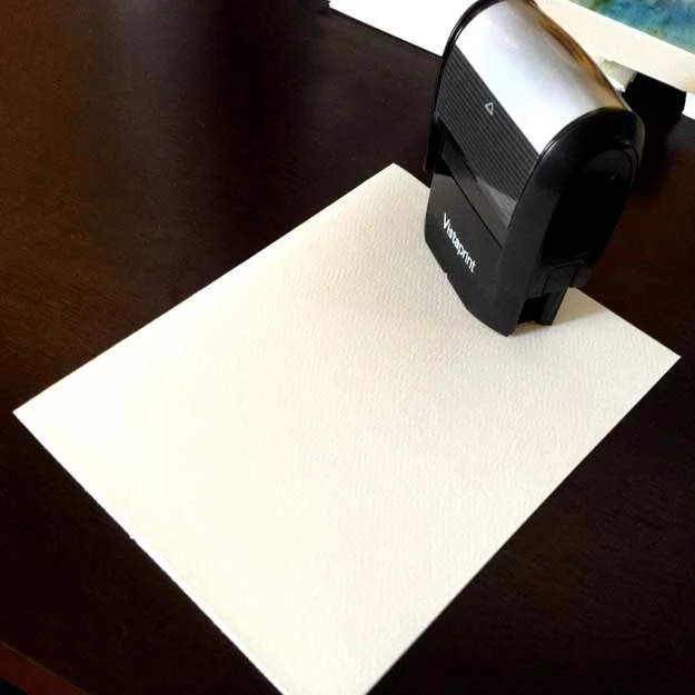
I use a stamp I ordered through Vistaprint.com with just my name, phone number, and website address. I find it a whole lot easier than printing on the cards using a desktop printer.

making-cards-6
making-cards-6

6. The envelope

Don't forget the envelope! It goes inside the card :)

making-cards-5
making-cards-5

7. The packaging

I package a finished card in an acetate envelope that is a tiny bit bigger than the card. I buy those through Clearbags.com but they are also available at art supply stores and even Amazon.com.

making-cards-4
making-cards-4

Voila! All done and ready to be sold, gifted, and in general shown off :)

making-cards-8
making-cards-8

Questions? How do you make your cards? Leave me a comment below!

How to use artist's tape

I discovered artist's tape not in a class or workshop but by a kind of accident. When we were learning to make our own giclee prints, we bought artist's tape to attach the prints to the back of the mats (which works very well, looks neat and can be easily disassembled). Recently, I started using artist's tape to block off the edges of my paintings to give the finished work a clean and professional look. I also used it for lifting off very thin lines in one of my recent paintings and, of course, for picking up areas masked out with liquid frisquet. The following step-by-step guide is one of the most popular applications of artist's tape - to give you a straight edge separating areas of different color in a painting. The painting I am working on is of the new building of the Mississippi Blood Services. It makes me think back to my first years in architecture school (nothing to do with blood..just the hands-on approach to architectural renderings). So, here I am going to do a gradated wash that represents the sky, while blocking off the edges of the building with artist's tape. Here is the drawing:

mbs in progress 1
mbs in progress 1

I need to cover the flag and some smaller elements with masking liquid:

mbs in progress 2
mbs in progress 2

I decided to mask out the stars on the flag but leave the blue area of the flag open to the wash. This way, I will be able to achieve more unity within the painting. Enter the artist's tape:

artist's tape
artist's tape

I applied the tape along the edge of the building that meets the sky. I also blocked off the top middle section of the building, so that I don't accidentally paint over it when I make the horizontal strokes of the sky wash. Make sure the edges where you need the straight line are completely attached to the paper. Otherwise you might end up with paint leaking under the tape.

mbs in progress 4
mbs in progress 4

I apply the wash upside down and keeping the painting at a slight angle. The color is a mixture of ultramarine blue, phtalo blue, and a little bit of verditer close the horizon - which, in retrospect, was not such a great idea. Phtalo blue is transparent and non-granulating. Ultramarine is almost transparent but quite granulating. As a result, my wash wasn't completely even and I had a couple of stripes of ultramarine blue that separated from the mixture and decided to go their own way. I almost scrapped the painting and started all over - but went ahead and applied a couple more washes to see if that would even everything out. To my surprise and delight, it did. I applied several gradated washes of ultramarine and phtalo blue, using only one color at a time. The result is this:

mbs in progress 5
mbs in progress 5

Not ideal, but definitely better and I don't have to start over! I also like the deepened color quite a lot.

Final tip on the artist's tape - before putting it down on paper, stick the piece of tape to your clothing (something not very fluffy or furry), like your jeans, and then apply it to your painting. This will make it a little less sticky and minimize the chances of you removing paint or damaging the paper when you lift it off.

Like I said, this is just one of the many, many ways to use artist's tape. What's your favorite? Do you have a secret trick involving artist's tape? Please share :)

Outdoor Art Show Necessities

I have something different today,

a guest blogger (who is my very own husband) :). This is a post he published last year, after creating out own art fair setup. It has served us faithfully through something close to 20 art fairs, farmer's markets and other events and it is still in good shape (unlike the Aaron Brother's frames that we got at the same time). Warm welcome to

The Artist's Husband!

:)

I mentioned in a previous blog that I'm not really a huge fan of most art.  My wife and I have been married for over three years now and I think I can count the number of art events that I've attended with her on one hand (I know.. I'm a bad husband).  But, I'm a changed man.  No, I still don't care too much for the majority of the art, but mention a show and I'm in.  Why's that?  The booths.

I think my wife and I make a pretty good combo.  I don't think that she could do, or would do, the business side of art by herself and I certainly can't make the artwork, but together, we're on our way towards making this a real business (granted, a very slow-growing one).  So, whenever we do attend any kind of art event, or even just a street fair or swap meet, I've got my eyes open for new booth ideas.  How to display product, how to interact with customers, what might sell and why, and try to apply those ideas to our own set-up.  It was also through looking at other booths, both in person and online, that we found out what all we would need in order to create a professional looking booth of our own.

"One must have money to make money" - I always thought this old adage was more true than is convenient, but in this whole process, I've found that there is a loophole nowadays that goes something like this... "One must have CREDIT to make money"..  I'm not sure of the financial wisdom of our business creation process, after all, we've basically taken a 9.9% APR loan for most everything that we've purchased.  A smarter person with a more structured business plan might have simply applied for a small business loan but we used credit.  Either way, here's what you can expect to spend to get started with a set-up similar to ours.

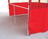
Canopy - the first and most important (and expensive) part of the set-up.  Though you can buy a standard 10x10 pop-up shelter for quite cheap, the quality will be quite cheap as well.  For the random event and light use, it may be fine, but we opted to go all out and get the professional version for durability (and to remind ourselves that this is a business, not a hobby).  Our frame is the EZ-UP Eclipse II model which is $675 from EZ-UP Direct.  Since we bought our frame from a friend without the top, we went through California Palms for the top and sides.  Their prices are great, the fabric they use is thicker than most others and they offer their "four-seasons" top ($140) which has air vents in the fabric.  This helps a bit with the heat but primarily allows the wind a place to escape without picking up and tossing our canopy.

Sidewalls are not a necessity per se, but I believe that it really completes the booth and gives it that professional look.  They also block the sun, wind and rain, keeping your booth somewhat protected from the elements though they can increase the temperature inside the booth a bit.  We leave one of the back corners open a bit to facilitate air flow.  Our sidewalls ($280) were purchased from California Palms along with our top.  Though their sidewall prices seemed a bit higher than the competitions, I am quite satisfied with them.  They are flame-retardant.  Each panel zips to the neighboring panel, but there is also an additinal strip of fabric that velcros the two together, providing extra strength.

Most fairs, shows and events require that you have a canopy and many require that it be white, so be cautious of buying one in a different color.  Many municipalities also require that it be fire retardant.  A typical booth space at an event is 10ft x 10ft so I recommend sticking to that standard size.

Tables & Chairs - We spent a surprising amount of time looking at various tables and sizes.  Do we go with two 8 ft tables and one 6 ft, four 6 ft, etc.  We wanted to have some freedom to mix and match so we could change our set-up as needed and neither of those options seemed great.  Also, most tables were 30 inches wide, much wider than I thought we needed.  Having one such table on each wall would mean that our "floor" space would be greatly reduced, making the booth feel smaller than it is without really giving more display room.  Eventually, we found some great folding tables ($30) at Target and Walmart.  They were 48" x 20", so they could be re-arranged however we wanted.  They were narrow enough that they didn't take up too much floor space.  They are light and fold down quite thin, yet are strong enough for what we are using them for.  We even found a matching smaller folding table for my wife to place her easel and art supplies on for the shows.  For table cloths, we went to the local fabric store and browsed their remnant and clearance racks.  We found a wonderful blue fabric that my wife then made the tablecloths with.  They look great and bring a bit of class to the set-up.

Chairs were easier to chose of course.  We bought two folding chairs ($60) and a folding stool ($20).  My wife usually works on the stool at her little painting table while the chairs are used for myself and anyone who stops by for an "on-the-spot" painting.

Print Racks - We needed a way to display our prints so we began searching the popular art catalogs.  I was astounded by the costs of print racks!  To be such a simple piece of equipment, the cost was really high.  So, being the cheap (wait, I mean "money-concious") person that I am, I decided to just make my own.  I went to Lowes and purchased some 1" x 2" Redwood boards, some brass screws, brass chain, stuff to make the pivot point and stopped at Wal-Mart to buy some black canvas (should have gone with white).  A few cuts and screws later and the frame was made.  Genia was sick of sewing table cloths by that point, so I cut and made the canvas part myself and affixed it with brass screws.  Easy job (about $20 each).  We made that one large enough to hold our largest prints which are 24" x 30" matted.

For the smaller prints, I decided that an elegant display solution would be to use tempered-glass display cases.  The glass panels are available for purchase individually so you can create whatever size you want.  Here is a website that lists the available sizes and prices.  Overall, they were cheap and easy and do a nice job and displaying everything up to 16" x 20" matted. ($15-$20 each).

Side-wall Display - Since we wanted to display framed originals and some of our larger prints on the walls of the booth, we had to come up with an easy way to "build a wall" to hang stuff on.  While I was browsing through the Calfornia Palms website, I came across some frame-rails ($50 each, must request rail only).  These are basically a "T"-rail that connects between two canopy legs.  My first thought was that this could be a great way to provide some stability to the canopy to help deal with the heavy winds we get here, so I bought three.  Then, I came across a product called grid panel ($11.50 each) which we could

affix to the canopy and the frame-rails to give us our "wall" to hang pictures on.  Grid panel, being steel wire, is quite heavy, so it was nice only having to buy 2' x 4' sections which sit on top of the frame-rail.  We purchased 12 panels total, four for each wall.  Lastly, we bought some grid-panel hooks that are great for hanging pictures from.

After a few uses, we found out that putting the grid-panels up and taking them down took longer than any other part of the booth set-up.  So, I decided to simplify things a bit by using zip-ties to connect each set of two panels together.  This meant only having to make six trips instead of twelve.  I also bought a roll of Velcro One-Wrap to make some velcro fasteners for the grid-panel.  I used two where the grid-panels connects to the top of the canopy, and three where it attaches to the frame-rails.  Now, I can take the grid-panel off and leave the fastening system attached.  Saves quite a bit of time and zip-ties.

Other Stuff - We decided that fine art greeting cards might be a good product to sell, so we purchased a 48 slot card rack ($49) from RobertHam.com.  Its nice and light, assembles and disassembles very quick and does a nice job at displaying our cards.

We bought our picture frames (appx $250) from Aaron Bros, using their 40% off-coupon.  Unfortuately, those coupons are only good for one item, per person, per day so we spent about three days going to all of the Aaron Bros in town to get the amount of frames that we needed (did I mention that I'm money-concious?).  We still aren't sure we like the ones we bought however.  They look pretty good, but the frames have a tendancy to scratch easily.  Regardless of what you get, I recommend cutting some cardboard "spacers" to go in between frames when they are packed for storage or transport.

If you don't have a bag for your canopy, I highly recommend one.  Our canopy bag ($50) is one of the rolling type, which I also highly recommend, especially if you followed my example and bought an expensive, professional canopy.  It turns out that "expensive" is synonymous with "heavy" as our canopy weights in at over 75lbs.  Wheels make transporting it much easier and it also protects the top from damage.

We purchased a canopy awning ($88) along with our the other items we got from California Palms.  While it is not an essential item, we felt that it would entice more people to visit, or at least loiter in front of our booth by providing a bit of shade on those warm days.  It does seem to work for that purpose and it also provides some extra sun protection for the artwork, especially since the print rack and card rack sit out from under the main canopy.  With concerns of wind damage, I made some braces for the awning that should help to hold up to most of what we get up here.

Oh!  Almost forgot the sand bags... If you will be showing in an area that occasionally gets even moderate wind, you'll definately want to invest in some good sand/weight bags for your canopy.  There are a number of different styles out there.  We opted to go, yet again, with California Palms.  Their weight bags ($50 for 4) are made of heavy duty canvas with velcro on the sides to hold it to the canopy legs.  What I like about them is that they already have the straps attached to fasten them to the top of the canopy frame.  This means that you don't have to worry about bringing extra straps along and with these being nylon, they wont stretch and allow the canopy to move like bungie cords do.

Two more things that are helpful, though not essential, are some big storage boxes ($20 each) that we bought from Lowes and a hand truck ($100) we bought from Costco.  The storage boxes provide an easy way to keep all of our prints, cases, accessories, etc together in one place, and makes for only two trips to the van instead of half a dozen, and the hand truck is great for those events where you can't drive up to your space to unload.

One last thing... The van.  We have Subaru Outback that we used once to transport all of our stuff with.  Granted, we had our son with us, but even without him, we would have had to strap stuff to the roof.  As such, we've invested in a 1997 Chevy Astro Van.  They are pretty reasonable to find used, have a great amount of cargo space (we leave the middle bench seat in and still have enough room) and drive pretty much like a car.  We considered getting a full-size van, but my wife wouldn't have felt comfortable driving and parking something that large.

Art shows, fairs, swap-meets, exhibitions seem to be a part of life when it comes to starting out as a professional artist.  While it can be boring and tedious, not to mention discouraging at times, you can improve your chances by having a professional looking booth set-up.

So, there it is,  all (or most) of what you'll need to create a decent looking booth set-up.

Total Cost (minus the van) - appx $2,000

Can you use makeup brushes for painting?

Before writing this post, I did a google search about using makeup brushes for painting and almost all the results were actually about using painting brushes for makeup (some even claim it is cheaper). So let me tell you my story. After attempting a couple of half and full sheet paintings recently, I discovered that my 1 1/2 inch taklon (good-ish synthetic) brush was no longer coping when I wanted to cover a large area in paint and achieve a smooth wash. Nor was my #36 round brush (also synthetic). It logically followed that I need a big brush with good paint-holding capacity (i.e. natural hair). If you ever looked for one, you know that even squirrel brushes start somewhere at $40 for 1" flat.

And so I had an idea. I was looking for a powder brush at Target when I saw "natural bristles" on the package. $5, worth a try? If it didn't work for watercolor, I still needed a powder brush, right? But it worked! It holds a bucket of water and paint and it is perfect for covering a large area. It even sort of holds a point when it's wet. So here is the brush (Studio Tools Powder Brush):

And a very quick wash on a half sheet (22x15"). I haven't even tried to make it smooth, hence some streaks. It is still a hundred times better than something I would get with my synthetic flat.

It took me maybe 5 loads total to cover the whole sheet - and not because the brush ran out of paint, but because I wanted to change colors or get more saturation. I was also afraid that the brush would shed profusely - but it didn't. It shed two hairs, and I can deal with that :)

Bell Peppers - watercolor and crayon on Yupo video!

Since several people asked me how I do paintings similar to "Tomato Juice" - watercolor on Yupo with wax crayon as a resist  - I gave up and made a video. Actually, i made three videos but only two of them with the camera on and only one where the painting is close enough so you can see what's going on. The result is one video and three paintings :) The video:

(sorry it's so small - I recorded it in vertical format :/. I promise I will know better next time)

And the paintings:

Watercolor and wax crayon on Yupo synthetic paper.

Watercolor and wax crayon on Yupo synthetic paper.

Watercolor and oil pastels on Yupo synthetic paper.

Watercolor and oil pastels on Yupo synthetic paper.

The first and last ones have oil pastels as resists.

Artist Network TV free weekend review

So, did you do the Artist Network TV free 4-day weekend? I did. And even though I felt that there was too much basic stuff and not enough good watercolor videos, it was nice. I "discovered" Stephen Quiller. That is, I've definitely heard the name before and saw some works, but last weekend, I discovered the way he paints. Fantastic. If I ever have a chance to take his workshop, I will.

Charles Reid turned out to be very boring, imho. Maybe he should stick to books :)

I enjoyed Mark Mehaffey's watercolor on Yupo workshop, even though most of the techniques and tricks he showed I already learned by myself and with the help of my online artist buddies. It was still fun.

A couple of things I learned from around 10 workshops that I watched:

  • When working from a photo, put it away as soon as you can. Copy machines do the copying, you do art. When you don't have the photo to imitate, you have to refer to your own mind which is a good way to bring a bit of you into the painting. When doing portraits, of course, I tend to hold on to the photos longer, but I still like to finish the painting without looking at the photo. It's not a "find 20 differences" game, it's a work of art.
  • Stephen Quiller, for example, along with many others, works from a black and white sketch (instead of a color photograph). It gives you the values, but also the freedom to make stuff up :)
  • I knew that most American watercolorists prefer flat brushes to round ones, but now I saw the flat brushes in action. I still like the round-ness of the round brush, and its ability to pick up the paint from my St Petersburg 24 pan set (a good size flat brush is too big for it). I still think that a round is better for some things - but I will be experimenting with flats, too.
  • A masking liquid tip that I already tested and determined that it's great: When masking, dip your brush (that you dedicated to masking for life) into water, then watered-down dish soap, then water. Repeat as needed. This keeps your brush clean!
  • It's better to under-do a painting than to over-do. Everybody knows it but we still need to be reminded now and then. Quiller actually said something along the lines of "When you're beginning to have a really great time doing something (like splashing paint or placing your trees in a landscape) - STOP!"

And that's a nice end of a blog post, don't you think? ;)

Virtual Paintout - April 2010, and hello to Aquabord

This month we (the diverse bunch of artists participating in Virtual Paintout) went to Canary Islands. Thanks to this awesome monthly project, the list of places that I have to visit, keeps growing...And I get to paint street scenes - which is not very feasible when you live in the middle of nowhere and have a small baby.

So, this is Aquabord. I'm not sure yet how much I like it - but it definitely has some advantages. First, it is a board. It is rigid. It does not require matting and frame is optional. It is super easy to lift watercolor (ink too, but I found that to be a little harder. You can end up with grooves on the surface). What I'm not so happy about is that, using my normal amount of water, the paint dries way too fast and doesn't really run and blend and do all that watercolory stuff. Maybe I just need more water.

Detail

Another detail.