There is something about compositions with two objects that intrigues me. I'm sure at some point in my art or design education, I was taught to not put two of the same thing together - something about symmetry and boredom and lack of focus. And yet I keep painting these pairs. Maybe I like the challenge of breaking a rule and attempting to make it not boring. Maybe having two objects gives the image a kind of a tension, charge, energy, as the shapes pull in different directions and vie for attention. What do you think?
illustration
How to Make Watercolor Batik on Rice Paper Step-by-Step Demo
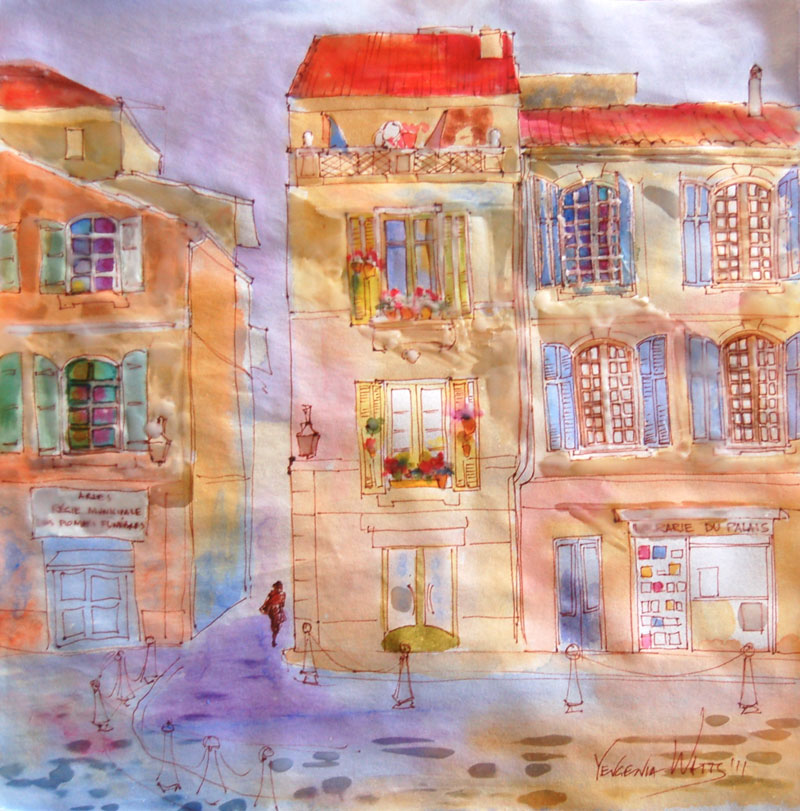
Watercolor batik is a painting technique that has been floating around for a while. I have painted on fabric before (not batik method strictly speaking), I knew the theory (basically, you use wax/paraffin in place of masking liquid and rice paper in place of regular watercolor paper) and I kept seeing paintings done in this technique here and there. Finally, months after bookmarking a demo by Kathie George on Artists Network, I decided to give it a try.
Materials and gear:
- Watercolor paints
- Some kind of oriental/rice paper. I used something looking like the regular sumi-e rice paper (the one that has no sizing and makes your paint run like crazy)
- Ink pen (optional). I used Pigma Micron
- Brushes - your regular watercolor brushes plus something designated specifically for applying paraffin. I used a 1.5" flat bristle brush from a hardware supply store and a couple of smaller bristle brushes.
- Electric griddle or some other way to keep the paraffin melted.
- Paraffin - I used a candle stump
- Iron
- Lots of newspapers/tissue paper/any thin absorbent paper that you can use for ironing the paraffin off your painting
The process
1. Make your drawing if you plan on having the lines. If you need to make a sketch first and then trace it onto the rice paper, be my guest. I drew straight on the rice paper - I think the uneven lines are not so horrible and actually add character.
Here, I already decided what my lightest lights are (a term meaning the areas of the artwork that will be the lightest in value. In watercolor, you typically leave them untouched, no paint at all). I masked them out with melted paraffin.
2. Apply first wash of color. You will be working from light to dark, so decide what your next lightest areas are and fill them in. Often, those are going to be your yellows, as they tend to be light in value. I also painted the bright colors of the flowers on the windowsills at this stage. I wanted to keep them fresh, so no more layers of paint on top.
3. Apply more paraffin to areas that you want to keep the way they are. Paint middle values.
4. Same thing. Mask out the areas that you are happy with and move on with another layer of watercolor. Here I am about to add the darks.
5. The image below is almost completely covered with paraffin.
6. More paraffin, more paint.
7. Once you're done, cover it all completely with paraffin and crinkle the paper. Apply a wash of color on top. I chose rusty orange to match the color of my ink lines. It will bleed into the cracks and bead on top of paraffin.
This step is optional. If you don't want the web pattern on top of the painting, feel free to skip it.
8. Newspapers and iron time. Place the painting between several layers of newspaper or tissue paper and keep ironing until all of the paraffin comes off. You will need to change the layers of paper to new ones in the process.
This is what it looked like after removing paraffin. I was fine with it for a day but then decided the white spots in the bottom third of the painting were just too distracting. When I tried painting them over, I couldn't: there was still some paraffin in the paper. One extra ironing removed it and I was able to tone the white spots down.
Here is the finished version:
Detail views:
And a handy time lapse video: French Windows
Hope you enjoyed it! Questions? Suggestions? Comments?
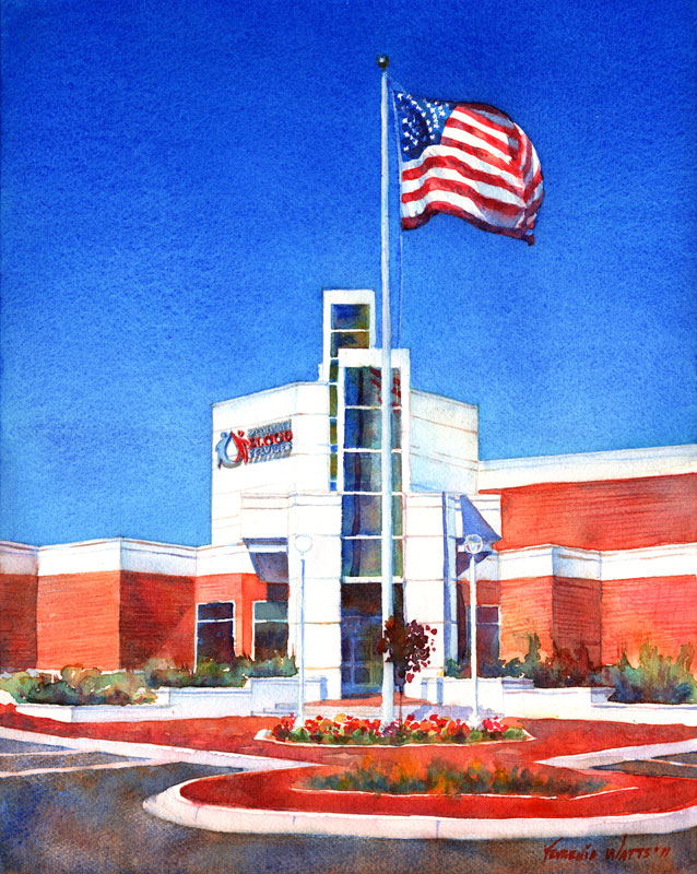
Mississippi Blood Services - completed painting
14 x 11" watercolor on Fabriano 140lb cold press watercolor paper. Another commission finished! :) I have to say that I do prefer portraits to buildings. Not sure how I ended up in architecture school in the first place...
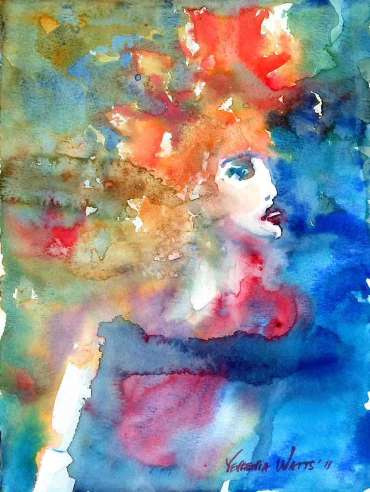
A Portrait A Day 60 - Audition for Shakespeare
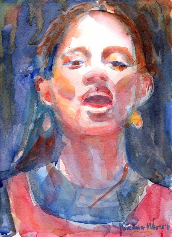 12x9" watercolor on Canson Montval paper (which, it turns out, not only allows you to wash away paint very easily but can, with equal ease, get the paint smeared off during normal handling :/).
This one is based on one of the 600 or so photos I took at the Renaissance Pleasure Faire last weekend. The girl was auditioning for Shakespeare. Not sure what exactly she was reading - first of all, I couldn't hear her very well, and second, I read most of my Shakespeare in Russian.
We've been trying to be a bit more active last month. Went zip lining in Big Bear at the beginning of May (that was also our wedding anniversary) and also to the Renaissance Faire last weekend. Both were quite fun, although I think I liked zip lining better... It was a rare kid-free outing and there were only two more people minus the guides with us. I'm all for less people = more fun!
Here's yours truly dressed up for the Faire and wearing one of the wonderful masks that were for sale there. I intensely wished I had more money to spend.
More pictures from the Ren Faire in my Facebook album.
Oceanside Days of Art 2011
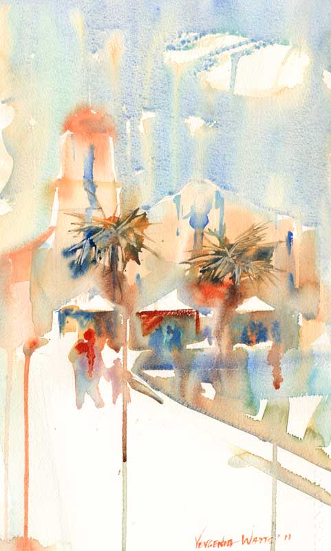 Oceanside is one of those things that I must confess I did not appreciate enough until I had to leave it. Going back there for two days of art fair was a treat (and getting a break from watching the ball of energy that is our son 24/7 was nice, too ;))! The show itself went ok - with gas and babysitter, we almost broke even. At least 50% of all the visitors at our booth were artists or art students. I was quite glad to explain my techniques and share my knowledge with them, along with receiving some tips back from them.
I met a couple of old friends and was amazed to learn that they follow my work and read my newsletters. It made me feel wonderful :) THANK YOU!
I also made many new contacts, including these fantastic artists:
Igor Koutsenko (who presented us with a poster of his woodcut Victory II, St. George on a motorcycle :))
Annie Aldrich (who lives in Big Bear Lake and makes amazing ceramics pieces that I was really hoping I would have made some money to spend on)
Catherine M.S. Cowles (who makes light fixtures to die for)
- and many more talented Southern Californians. It was worth it just for the opportunity to be there among all those creative people.
The painting above was done using a not-so-popular method of working from a black-and-white sketch made on location. The idea is for you to be there and experience the surroundings while making an abbreviated version of what you see. Your sketch, then, gives you a framework, a recorded idea that you interpret drawing from your memories and intuition rather than reproducing a photograph. This painting could have been much better, of course, but I like it :). Here is the sketch it was based on:
Just for comparison, here is a plein-air painting of the same church that I did in 2009. This one belongs to my "how not to paint in the future" bin.
And to complete your Oceanside experience, Decemberists :)
http://www.youtube.com/watch?v=2jjn-uoENPA&NR=1
A Portrait A Day 58 - Tanya
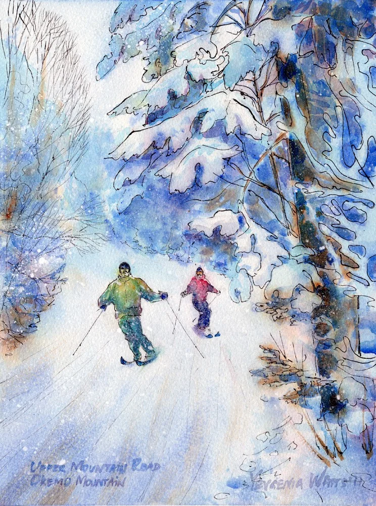
Ink and watercolor winter landscape - step by step
This painting was a commission I did for someone who gave it as a thank you gift for a wonderful skiing vacation at the Okemo mountain in Vermont. As usual, I started with a sketch:
And, since the client wanted two skiers in the picture, a rough Photoshop mockup:
On to the drawing and the first wet-into-wet wash (paper is stretched on an 11x14" stretcher frame and bordered with artist's tape to a 9x12" size):
At which point I remembered that this was supposed to be an ink and watercolor painting...
And after this, there was darkening of shadows and intensifying of color here and there. I also added some iridescent medium and snow, along with the writing on the bottom, to arrive at this:
At the request of the client, I mailed the painting directly to the couple who generously let them stay at their house during the vacation at Okemo. I included one of my note cards that I think goes very well with this painting:
Virtual Paintout - Romania
 6x6" Ink/watercolor on Ampersand Aquabord. Location is in the city of Bucharest, Romania. Check out the other entries at the Virtual Paintout Blog! They're getting better every month.
Romania shares a border with Ukraine, where I am originally from. Virtually "walking" the streets of this beautiful city made me a bit homesick - which, I must admit, I have been for a while now... I know there isn't much point to it, the country where I grew up is not the same it was seven years ago, the people have changed, grown older, and we don't even talk anymore - and yet I can't help it. Something will always pull me towards that place on the other side of the world.
Virtual Paintout December 2010 - County Clare, Ireland
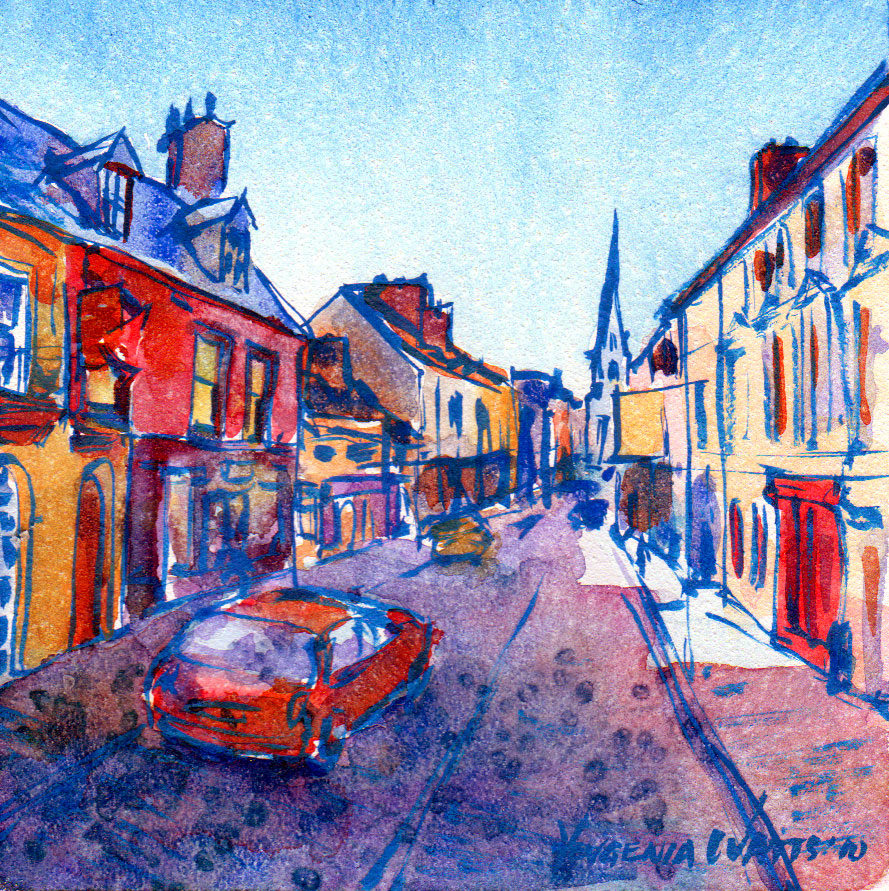 Ink and watercolor on Ampersand Aquabord, 6x6". Location is the city of Ennis, County Clare, Ireland. My husband was quite surprised that out of all the beautiful meadows and seashores and sheep and cottages that I could have found in Ireland, I somehow picked this street view. Well...I like the meadows and cottages, but my heart just aches for the narrow streets lined with old buildings, each and everyone different from its neighbors, with small shops on the ground floor and huge chimneys sticking out of their roofs...The feel of old Europe. Ireland has been my dream vacation spot for many years now and some day I will go there.
You can view all the other entries in December Virtual Paintout here. To my surprise, there is one pastel painting of the same street looking in the opposite direction!
When We Stayed in Lisboa - watercolor on Aquabord, step by step
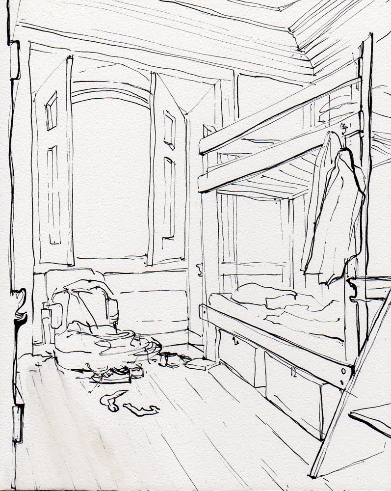
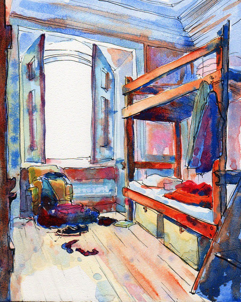
 This is another commission that I got through Etsy.com. It is an 8x10" ink and watercolor on Aquabord painting of a hostel room in Lisboa (Portugal).
Step 1 - Ink drawing
Step 2 - color. I could have easily stopped at this point and I'm still wondering if I should have.
And step 3 - detail and deeper values. After finishing, I sprayed the surface with clear gloss fixative and brushed on two layers of gloss varnish. While Aquabord is not my favorite surface to work on, it is extremely easy to frame (or display without frame if it's cradled) and, enhanced by gloss varnish, the colors on Aquabord look vivid and rich.
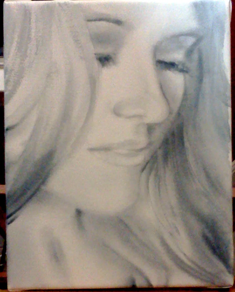
A Portrait A Day 44 - Christina - step by step
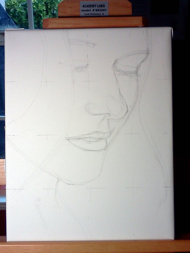
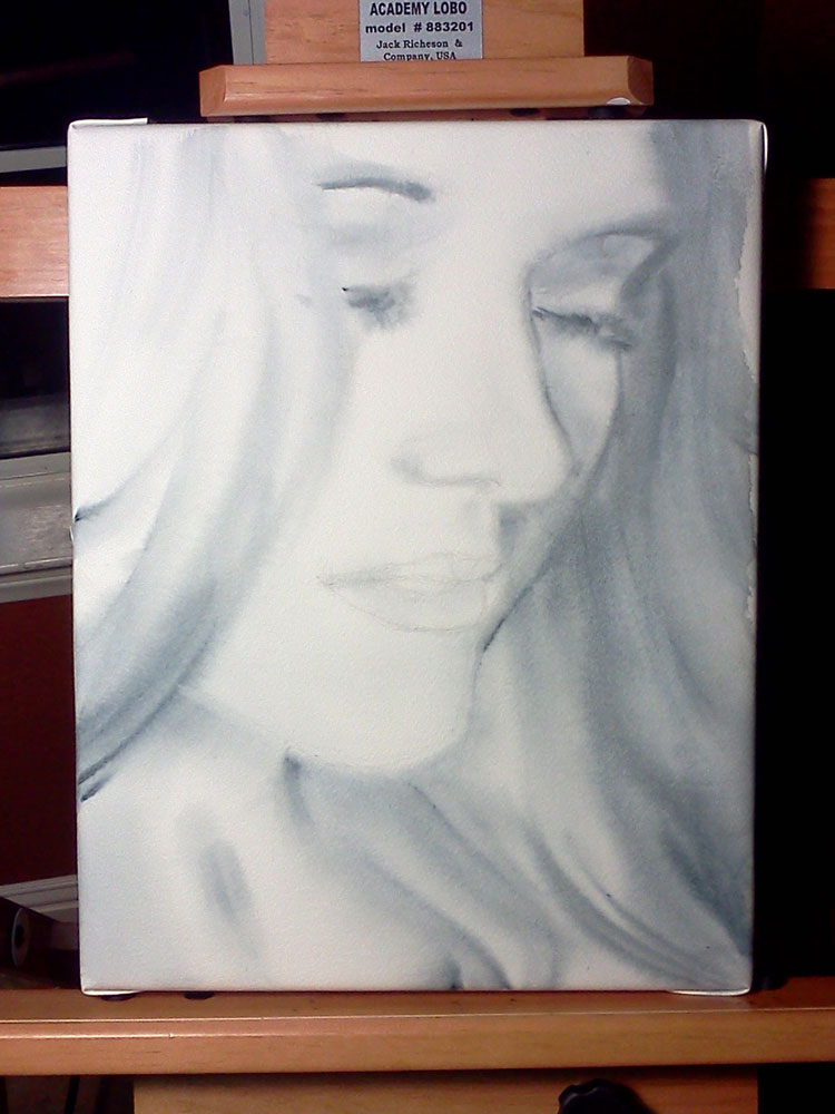
This painting was a commission I got through Etsy's custom requests section - Alchemy. It is a Christmas present for the person depicted. I do hope she will like it :). Since it was a custom request, I worked a bit bigger than usual (this is an 11x14, which makes her face a lot bigger than life size) and finally found use for my tube of Payne's gray (I never use it otherwise). The client said that the resulting painting was "exactly what she envisioned" - which is nice. But if you are at least a little familiar with my work, you know that working in grayscale must be pure torture for someone who loves color so much! I can't say that it was torture - and I even kind of liked it before adding the red lips - but I promise you, the next post will have COLOR! :)
This is probably not the most interesting painting to show step-by-step photos for, but I made this anyway so that the client could keep track of where I was in the process. Here they go:
Step 1 - the idea sketch. We decided on showing a bit more of her face and neck. I did the grayscale first, then added the bright red lips, and then, wanting more color, I tried adding a bit of pale color. I wasn't sure at this point if I would add the pale color in the big painting or not.
Step 2 - the drawing...what usually takes the most time. I skip this step in my portraits-a-day but I felt that I need to do a drawing here because the face was so much larger than life size. I used the grid method to establish major points in the drawing.
Step 3 - wet-into-wet. I liked it quite a lot at this point.

Oh yes! Meet my new easel! It's a Richeson Academy Lobo and I love it so far (as does my son, who thinks it's an excellent play gym).
Step 4 - more detail, deeper shadows
Step 5 - the red lips!
Step 6 - the final version, with some areas corrected, deepened and more detailed.
Here it is.. Here are also the holidays, my family, more commissions, and a lot of material to post. Hopefully, I will find the time for a couple more blog posts before the New Year, but if not - Merry Christmas and see you in 2011! :)
Laundry Day in Rio - Virtual Paintout
Watercolor and ink on Ampersand Aquabord 6x6". A last-minute sketch for the Virtual Paintout. I loved the scene though and maybe will go back to it for a larger piece.
A Portrait A Day 33 - Magdalena
Watercolor on Arches CP 140lb, 9x12. I painted this portrait for Andy Donohue from Julia Kay's Portrait Party. Magdalena is his girlfriend and her birthday is coming up. Andy asked people in the portrait party if they could paint/draw Magdalena and I agreed. This was fun to paint! The reference photo is very interesting and has a high resolution. I had a good idea of what I wanted the painting to look like and I did most of it wet-into-wet, defining the sunglasses a bit more than everything else at the very end. I like it.
Here is a detail of this painting:
And Happy Birthday to Magdalena, whenever it is! Sto lat!
San Miguel de Allende - October Virtual Paintout
Here I used one of the four brushes that my dear husband brought me from Japan. I'm sure there's a name for this kind of brush but I don't know it :) It has stiffer, longer hair in the center and softer, short light hair (goat?) on the outside. The variety in the hair length and stiffness adds variety to the brushstrokes. A rather interesting tool :)


Don't forget to take a look at all the wonderful entries for this beautiful, colorful city at the Virtual Paintout blog!
Manhattan - Virtual Paintout
A very quick wax crayon and watercolor on yupo, 10x10". I definitely could have used fewer lines!
And a very dead day at a very local arts&crafts fair. It was their first day of the first year running the fair, and it was a Friday. And we got a thunderstorm by the end of the day - something that almost never happens here in the desert. Everybody at the fair is hoping for a better tomorrow, and me...I'm just enjoying a break from being a stay-at-home mom.
A Portrait A Day 21 - Goat Transforming into a Cathedral
Watercolor over acrylic gel medium, Arches CP 140lb, 9x12". Reference photo is Goat Transforming into a Cathedral who is also in Julia Kay's Portrait Party, who makes fantastic art and whose Flickr name, when abbreviated, looks remarkably close to "Gotic" (this is the grand revelation I had when naming the image file). Enjoy!
P.S. I can kinda see a cathedral in that abstract background on the right...I mean, of course I planned it all to look like that ;)
Charlottetown City Hall, Virtual paintout August 2010
Well, my daily painting today was "unblogably bad" - to quote Genevieve of Summoning of the Muse. So I'll try again tomorrow and for now, here is something I forgot to post in August:
Crayon and watercolor on good ole yupo, 7x10" or so. The location is in Charlottetown, Prince Edward Island (Canada).
A Portrait A Day 15 - Ken Meyer Jr
Watercolor on Canson Montval CP 140lb, 9x12. Took me around 35 minutes, not counting a couple of breaks. The painting turned out very saturated and colorful and I had difficulties making the image match the painting. This should give a rough idea, though, of course, it's almost always better in person.
Ken Meyer Jr is an artist and illustrator I "met" through RedBubble.com. He sent me some pictures for my A Portrait A Day project and this is the interpretation of one of them. Check out Ken's website here.
A Portrait A Day 6 - Angela (using gel medium with watercolor)
Watercolor on Canson Montval CP 140lb, treated with acrylic gloss gel medium in some areas. 9x12". Photo reference: Angela from Julia Kay's Portrait Party.
For those interested to know what "treated with acrylic gloss gel medium" means, here is what happened. After I decided on the composition, I wanted some extra texture in her hair. I accomplished that by taking some gel medium and brushing it on the blank sheet of paper with a 1" bristle brush. You can see the lines in the upper and lower left and grain throughout the painting. The lines are the result of a little more medium on the brush; the grain effect happens when you drag an almost dry brush across the paper and the medium catches only the very top of the paper grain.
I uploaded a larger than usual image for you to see the texture close-up. Needless to say, I would be very upset if somebody used this image for their own commercial purposes. So don't :).
A portrait a day
I had a fabulous idea yesterday: what if I paint one 30-minute portrait a day for a...week? I would have 7 paintings, 3.5 hours of painting practice, and possibly an unnoticeable improvement in my work. What if I do a month? 30 days x 30 minutes gives me 15 hours and 30 paintings! Tangible, eh? You can even do a show with 30 portraits. And then I was looking for a good number of days to commit to, between a month and a year. I found the number 206 - which is the number of bones in the human body. It ties nicely to my focus on portraits and will also remind me to turn to my anatomy book more often. Here is the math (and prepare to be impressed :) : 206 days x 30 minutes x 1 painting = 6180 minutes, or 103 hours of painting, and 206 portraits to show for it!
So here is the project: I will paint 1 portrait every day for the next 206 days!
I will post the results here. I also invite you to join me in on this journey if you would like to improve your painting/drawing skills or just need something to work on. The rules are these:
1. The project will run for 206 days. I started yesterday Sep 2nd and will continue until March 27, 2011. Feel free to join at any time and continue for however long you decide to. You can do every day like me or every week, or twice a week. It's up to you. For best results and for peer pressure, I recommend every day ;)
2. I will paint both from life and from photographs. Right now, my sources are my own photos, those of my friends and relatives, Julia Kay's Portrait Party, WetCanvas reference library, and Flickr Creative Commons. If you would like me to paint from your photo, please email it to watercoloredhands AT gmail.com
3. I can paint the same person more than once, use any technique and any size. If taking pictures is your thing, I welcome photography, too.
4. I intend to spend 30 minutes plus/minus 10 on each painting. I found that for watercolor, it makes sense to break the 30 minutes in 10-minute intervals to let the painting dry in between - and to give me an opportunity to step away and take a look at my work from a distance. Plus, I can rarely have 30 minutes straight of uninterrupted me-time. So, the idea is to spend 30 minutes total a day.
5. Art is not about following the rules, so...take it easy :)
Depending on how it goes, I might post other people's submissions here or include links, or maybe create a Flickr group. I also intend to take an occasional video of the painting process and post a mini-lesson on anatomy for artists.
And so, the question is, " Can you find 30 minutes a day to spend on something that is enjoyable, useful, and is NOT physical exercise?" ;)
