New sketches, and thoughts about "The Creative License"

Hello world! I had no internet for a couple of weeks and it wasn't that bad, actually. Refreshing, I'd say. Suddenly, you have time.

Of course, that doesn't mean that I immediately became productive and accomplishing...But I did some work on my in-progress paintings, sketched some, and played with Yupo. And I finally found the time to read.

Just today, I finished "The Creative License" - another book that I "heard" a lot of positive comments about in the online world. Some people swear by its powers to unlock their creative potential. Well, there are good thoughts in it.

I struggled through the first two or three chapters and considered putting the book away, so uninteresting I found the beginning. I also did not appreciate the occasional bullying tone (or maybe I'm too touchy, and it was supposed to be friendly encouragement?). There is a liiiiitle too much about Danny Gregory in this book. I mean, in some cases, a little personal touch is good (like in "Everyday Matters", it was perfect), but it feels wrong in a book titled "The Creative License: Giving Yourself Permission to Be the Artist You Truly Are." What is the purpose of the 3 pages devoted to how Gregory learned guitar with his son, for example?

I also thought it was very fragmented. It seems like a collection of little bits of random thoughts, rather than a coherent work written from start to finish. I'm not saying it's bad, but it's different. Could make a nice calendar. Or a "daily devotional" type book.

95% of what Gregory presents as discoveries, I have already discovered by myself or with the help of somebody else. Like seeing beyond local colors or thinking in the shower. Seriously, I even have a waterproof notebook with a waterproof pen. I still can't decide if it's me knowing more than I thought I did or if Gregory's stuff is too basic.

But like I said, there are good things about this book. I loved the quotes from different "creatives" and little facts about them. I copied down the movie list. Some deeper musings beyond the first couple of chapters I could relate to.

I think Gregory is successful at making a doubting artist (and aren't we always doubting?) feel better about what they do. Would he convince me to start an illustrated journal if I didn't have one already? I'm not sure.

And - too bad, I already was on an "electron fast" - since we don't watch TV and we didn't have internet!

So, that was my critical and skeptical 2 cents. Most people think the book is great, and it's probably a good reason for you to read it :) As a matter of fact, I recommended it to my husband, since he confessed to me that he wants to learn to paint (big secret, by the way, and I'm kind of excited about it!).

And here are some recent sketches:

More latex paint, as you can see! :)

EDM 24 - a piece of fruit.

EDM 124 - something yellow. My son's alternative to a rubber duck. The drawing was quite a fiasco, actually. I drew it with pen, which turned out to be not at all waterproof when I tried putting watercolor on top. Watercolor didn't want to stay on latex, either...It kind of did on the second try, and I even got an interesting effect where the paint sank into the little holes in the latex that I poked with the pen when shading...Overall though, it sucks. That day sucked, too :(

EDM 13 - telephone and 4 - cup:

And there's also EDM 137 - something you can turn on or off (unfortunately, only one of the items in this sketch are on/off-able ;)

Share

The tale of the three girls and their portrait

It is done. I have silenced my inner critic and declared the painting completed. A few lessons learned:

  • Request high resolution, high quality photographs if you can't take your own. Even if you don't detail your painting too much, the information from a high quality photo is valuable.
  • For two out of three subjects, I used one photo for drawing reference and a different one (or, actually, more than one) for light/shade reference. That is hard, although I am mostly pleased with the results. One good outcome of this method is that the painting doesn't look (I hope!) like a copy of a photograph. A negative side of it is that it definitely takes more time than working from a single photo.
  • Speaking of time...It took me longer than I anticipated. Next time, I'll know. Hopefully :)
  • The Everyday Matters Yahoo group is a bunch of wonderful people. I am so glad I joined. I requested help with completing this painting and I had very useful critique within hours. Plus the encouragement that every single artist needs so much in order to keep creating art. My husband was very helpful, too, especially since he had the real painting to critique, not the photo of it.

Here is the last photo I took of it. Still a little bit of waviness present. At some point, I just had to make myself stop, put the brush away (speaking of brushes - this all was done with a W&N Cotman synthetic round #14, which is a decent brush, but it made me want to expand my brush arsenal), and let it dry in peace. If I kept working, I'd work it to death.

The clients loved it. I received passionate feedback on Etsy and they promised to tell friends and family about me. Overall, this was fun!

Share

Virtual paintout and EDM 160

Some time during my very important blog-browsing and website-wandering, I have discovered the Virtual Paintout. It seemed like a great idea and I put it in my heart to start doing it someday. Well, this here is my virtual paintout for February. Not as big and serious as I wanted it to be but at least it exists. I still have a couple of interesting shots that I would like to do but I don't think I'll get to them by the end of the month.

The blobs in the background are my attempt at using a stamp that Nita Engle talks about in her book. Basically, you take a piece of illustration board, cut stuff on/out of it (a tree, for example), make a handle out of a piece of masking tape, put paint on the face of the stamp and press it to the paper. And then you find yourself surprised, disappointed (try again!), intrigued, hooked up...

In this case, I made mine out of a piece of floor underlayment. It didn't work quite like I expected, but it also surprised me in a good way: those rounded areas of foliage were not planned at all.

And here's EDM 160: a trophy or award. This one belongs to our friend and says "XR80 Indoor World Champion 2002" - whatever that means :) I only know it has something to do with motorcycle racing

This is another side effect of my recent home remodeling activities. I toned the paper in my watercolor Moleskine with latex flat finish interior wall paint. The rest is pen and conte crayons.

Share

For Valentine's day, I got a house

For Valentine's day, I got a house. Well, of course, it wasn't my Valentine's day present, it's just that we finally closed on the house last week. So my husband, not being a very celebration-inclined person in general, skipped the flowers and chocolate and declared that the house was my present. As for me, I obviously lack similar grandeur, not to mention finances, so I went with a good old valentine:

:) He likes medicine.

And then I was painting. The walls in my new house, all 3-day weekend! Pretty exciting and fulfilling, I think, especially since my whole family came over to help. My mom was watching the baby so I could finally do something with a visible result (versus baby-watching, which is hard work but is not immediately gratifying).  And oh, after years of living within walls of all shades of white and taupe and beige, it is wonderful to have heavy orange, and beautiful blue, and saturated green, and tasty yellow around me!

Also, I had some quiet time today to sketch EDM 22 (a piece of clothing):

I used a non-waterproof pen and really enjoyed it this time. I was ready for it to run and smudge, so I used these properties to my advantage. I think I need to get some color ink...

Share

EDM 241 and some more Yupo paintings

I really liked the idea of EDM 241 - "draw what you see from your kitchen window." It makes me want to become socially active and do a series based on views from other people's kitchen windows. This one is actually NOT my kitchen window. The only thing that's ours in this sketch is the hammock.

And I am not done with Yupo! I painted a fruit bowl to thank Lisa Thayer for "guest squeezing" me a couple of weeks ago:

Juicy colors, once again.. Here's a detail:

I'm very tempted to crop it and get rid of all the background and most of the fruit in the upper right. What do you think?

Another Yupo, inspired by a glimpse of mountaintops as I was driving through the San Bernardino mountains overpass:

With this one, I tried some Kleenex tissue texture and also blowing on the wet paint through a straw (along the bottom). The blowing did make the paint run upwards in a slightly interesting pattern...But maybe it's not all that effective here. I'm still wondering if I should add some detail in the bottom part of the painting. Some bushes or ferns or something.. On one hand, it could make the painting more interesting, on the other, it could kill the fluidity and fogginess of it.

Share

What do you want from your art?

I've heard that it's normal for artists to not feel happy about their art. That it's just a part of their nature to always wish they were better. I often find myself thinking that the art I like is not the art I make and vice versa. I keep wishing for more complexity and sophistication in a world of watercolor where "less is more." I want hidden meanings and multiple readings - because that is what I like about other people's art! I want to be able to imply things instead of spelling them out (Jean Haines is great at it). On the other hand, I've learned a lot since I started painting, and sometimes I even surprise myself ("Did I do that?"). My criticism of my own work has never made me want to quit, but to be better. So I guess it's a good thing?

Meanwhile, here's EDM 258 "Draw the inside of your closet." I had to work around this one...We are currently living in a friend's house, so technically, I don't even have a closet. There's one in the bedroom we are occupying but you can only see one half of it at a time and it's quite boring anyway. So...I saw a clothes rack in the garage, with a bunch of leather motorcycle suits on it and that's when it hit me :)

Our friend has a motorcycle gear and accessories business and a motorcycle school, sort of.

Oh, and here's EDM 23, "Draw your foot." Did this one while watching "Kill Bill" :)

Working my way through " An Illustrated Life" - great book, by the way (I gave it to my little brother for Christmas and ended up liking it a lot myself and checking it out at the local library (my brother lives on the other end of California or I would have borrowed it from him)) - one thing I learned, or rather, been reminded of, is the need to slow down when I am sketching. Somewhere in my last two years of university I developed this speed drawing habit, together with straight lines (great for architecture but not for anything else) and now I need to break it. So I've been trying to draw slower. However, here's a counterexample: I only had several seconds to sketch my husband holding our suddenly hyperactive son when we were at a restaurant:

My husband says that it's a horrible drawing. Well. I think it's ok for 7 seconds :)

Missed Connections

In case you haven't seen it yet, here's the link to Sophie Blackall's Missed Connections. They are: adorable, quirky, funny, ironic, sad, and beautiful. She says,

"Messages in bottles, smoke signals, letters written in the sand; the modern equivalents are the funny, sad, beautiful, hopeful, hopeless, poetic posts on Missed Connections websites. Every day hundreds of strangers reach out to other strangers on the strength of a glance, a smile or a blue hat. Their messages have the lifespan of a butterfly. I'm trying to pin a few of them down."

Yay! A new commission!

I heard (read) a lot of good things about Etsy.com. I bought beads from there (when I was into making jewelry) and recently, BumJoy cloth diapers. A couple of weeks ago I decided to try out Alchemy, the piece of Etsy where you can request custom items to be made by the crafty maidens and the crafty maidens bid on them. Kind of like the design-bid-build method of project delivery. Oh wait, I guess it's more like design-build...Anyway, I bid on a couple of requests for custom paintings and I won one! It is a group portrait of three little girls.  I promise to post the progress reports! :)

About some books

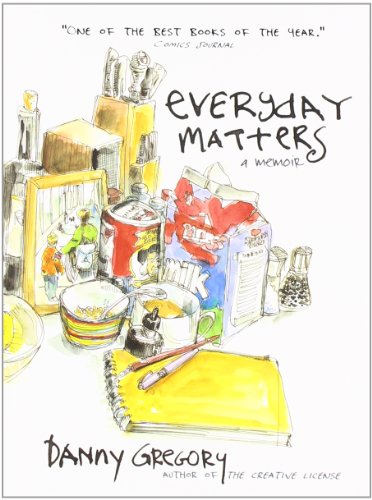
One of the books I'm reading now is Danny Gregory's "Everyday Matters." I've always liked books where pictures take up more space than words. It is great, and my only regret is that it is so short. One quote that I wanted to share is about the process of drawing: The reason why most people draw badly is because they draw symbols instead of what they see. A nose is a sort of triangle. An eye is a circle with another one inside. An ear is a circle with a squiggle. The brain has an inventory of shorthand symbols for stuff and that's what we draw.

It's very human. Assigning things to categories, using symbols and signs; these skills separate us from the beasts. Unfortunately, these symbols are a screen through which we come to see the world. We say, "That person is rich, that one's crass. He's a criminal type, she's a blonde, they're famous, she's in a wheelchair..." We lump people and things and experiences into categories and deal with them accordingly. It's efficient but it strips the world of texture and chance, like eating every meal at McDonald's or wearing the same uniform every day.

This kind of thinking shows itself when we try to draw. In fact, that's the reason most people will say, "Oh, I can't draw." Kids never say that, until they reach the age of twelve or so, and their symbols are hard-baked.

I think this is very true and it's also true when it comes to painting and seeing color.  A yellow lemon is not always yellow, and white is not the absence of color but pretty much any color you like...I love looking at colors around me. I get excited about colors and my husband shakes his head and calls me a dork. I savor the warm reds and oranges and deep blues, I decipher the grays into yellows and purples and greens. Colors make me happy :)

On a different note, another book I'm reading is "The 12 Secrets of Highly Creative Women" by Gail McMeekin." It has glowing reviews on Amazon but so far, I'm finding it quite disappointing.  The best thing about it is the quotes on the margins. It could be useful to somebody who is stressed, depressed and lost in their life and has no creative outlet. I was looking for practical advice and this book is more like a counselor. Get in touch with your intuition, spend time with yourself, and fuel your creative energy. All good stuff but nothing new.

Girl with grape-vine, and another child portrait

Good morning...I think I would pay somebody to let me sleep in on a Sunday morning. I worked on two portraits yesterday, one commission and the other a painting of my husband's little niece. I saw a photo of her wearing a bright multicolored scarf and I just had to make a painting! :) Here are pictures at the beginning and at the end of the day. You can definitely tell which one I worked on more:

And the little girl:

Both of the subjects are back-lit (contre-jour!), and in the case of the girl with grape-vine, there is also flash from the camera, all of which makes working on it a little confusing. I find myself inventing the shadows and lights on her face, and it feels like her whole face should be much darker.

Starting on a new commission!

And planning to document it from beginning to end. I kept putting if off because there is work to do before starting the act of painting but now I feel ready :) I will be working from photographs:

So, I played with different variations of the composition. I picked the first photo as the main reference and cropped it this way and that while sketching ideas of the composition. I moved the grape-vine to cover more of the face, to give it a little more playfulness.

I was still not quite sure about the composition so I decided to make a full size sketch and see how that looks:

I like the diagonal movement of the grape leaves and the overall V-shape that the direction the girl is leaning in and the grape-vine are forming. I also decided to give a little more space in the upper left area. I can always crop it if I don't like it in the end.

Of course, there are precedents of a "girl with grapes" in art history. The one I've known since art school is by Karl Brullov:

"Italian Midday" 1827. Back in the day when being plump was good.