Flowers

A painting, and also some thoughts on the year past

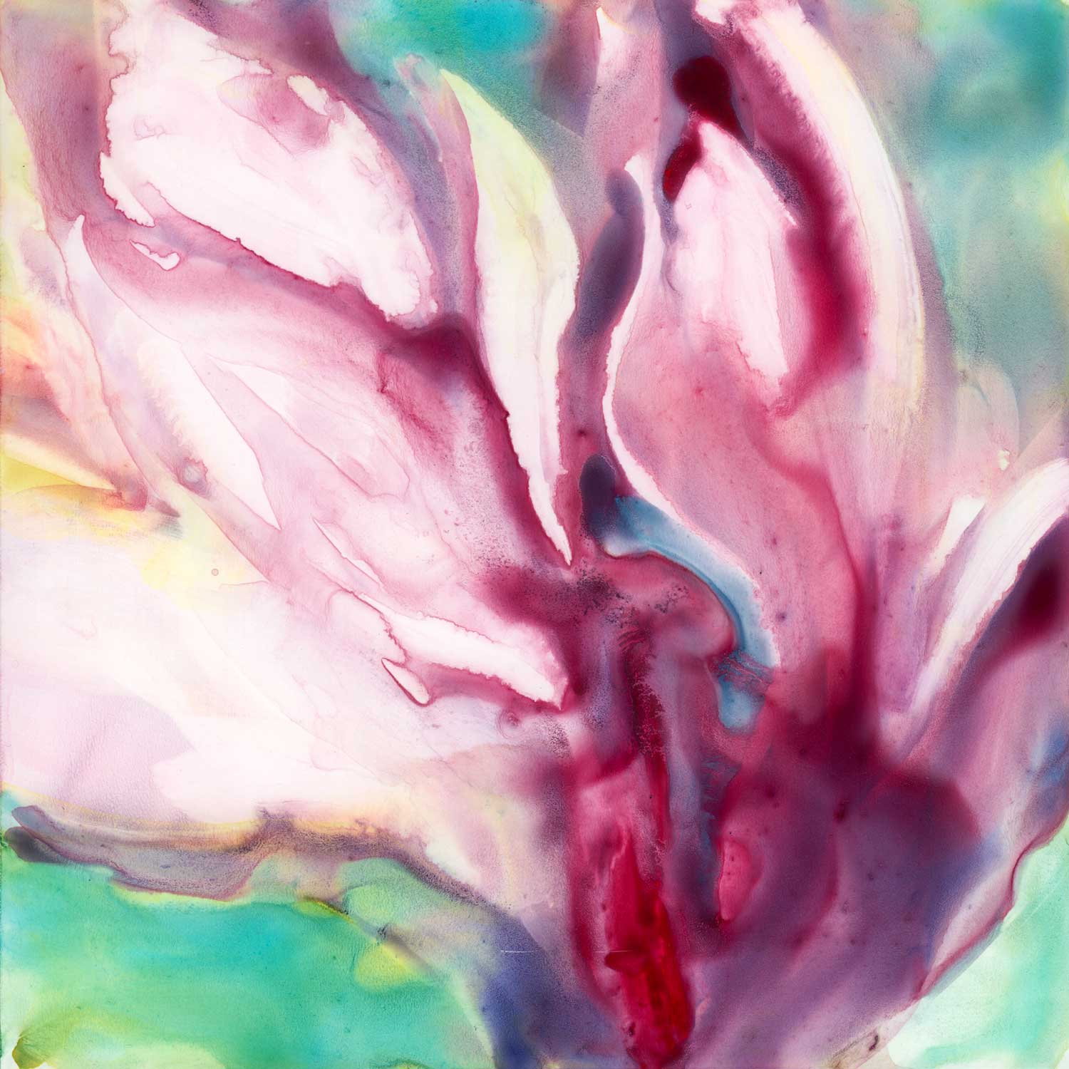
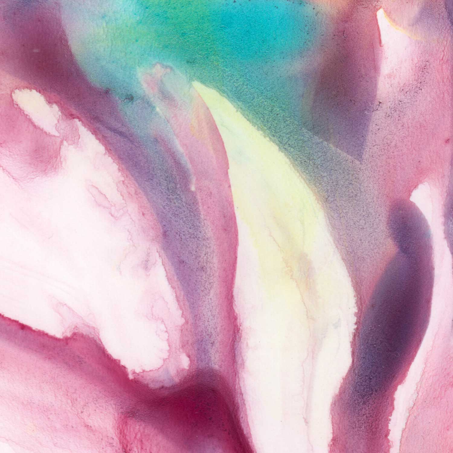
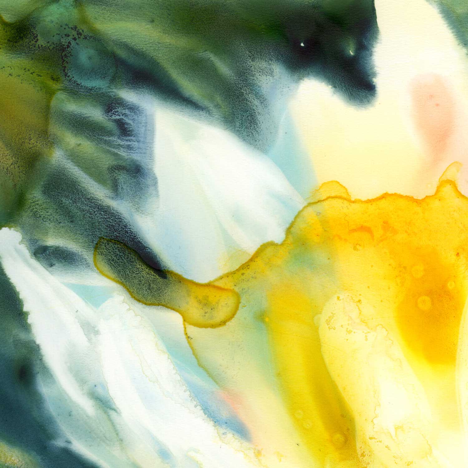
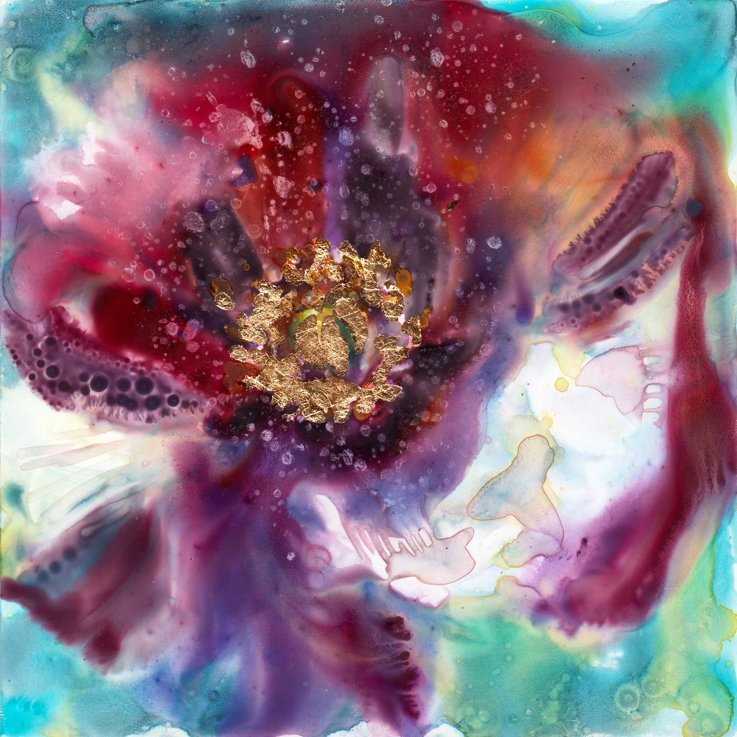
First things first - I'd love to share with you another one of my floral paintings on Yupo. Take it as my visual New Year gift to you if you want. Enjoy it, breathe it in, feel it. This one is called "Reverence" - because, as I was painting it, the white flower was almost nodding at me, in an old-fashioned greeting and sign of honoring the other person. And I, in turn, was filled with awe and reverence for the simple beauty I was experiencing.

"Reverence" - watercolor on Yupo mounted on board. Click on the image to learn more.

"Reverence" - watercolor on Yupo mounted on board. Click on the image to learn more.

Now, on to some reflections on the year 2016. This end of the year summary post is actually one of my favorite kinds to write. I like thinking in broad terms and I always discover something good I forgot to acknowledge! 

Alright, so, some exciting things happened last year:

  • I went and got a job. There are many sides to this, both good and not very, but overall, I feel that it was a good decision. Architecture is the right fit for me and doing it full time allows me to do what I love while growing my skills and expertise exponentially. And it comes with a paycheck ;)
  • On the other hand, my husband quit his job. And just as I was gingerly enjoying being the other parent (the one who goes to work and doesn't do anything around the house), he bought a retro video games store ,What can I say, the other-parent thing was good while it lasted ;)
  • For the first time ever, I got published in a book. Two glorious spreads in "The Art of Crayon." Pretty happy about that!
  • Along the same lines, I saw a magazine publication with my editorial illustrations and a nice interview write-up about the artist come to life in 2016.
  • Two covers of the English Teaching Forum. Also kind of cool :) A subscriber from Equador reached out to me after seeing the art on the cover. Little moments like that are the best part of putting your art out there.
  • Jung Katz published an interview with me. If people keep doing it, I'm going to have to start a binder or something :)
  • I led a paint night for a local non-profit. It was fun, and my limited experience with acrylics was enough to make it a success!
  • I participated in a couple of local art shows and several life drawing sessions. Definitely something I want more of this year.
  • I learned something new. That's actually the understatement of the year. I learned a ton of stuff related to my architectural work - but I also took a guitar class. I'm signing up for the next session, so look out there ;)
  • I went to see Iron and Wine at the Gundlach Bundschu Winery. If none of this made sense to you - don't worry about it. If it did, you know it was awesome! More live music in 2017, please.
  • My girls started preschool. It was a tiny bit scary, like any change involving my kids, but everyone adjusted just fine. The highlight of 2017 will be Katia entering kindergarten. Oy.
  • We saw the ocean and snow and mountains and vineyards and orchards. I'd like to do more of that this year.
  • Katia broke her arm. The year before, it was her leg. I wonder what next...
  • I had an ice cream sandwich for the first ever. I'm not talking about Klondike bars. I'm talking about two soft, fresh oatmeal cookies with a scoop of yummy ice cream in the middle. There is no way back.

So there, highlights of my 2016, in no particular order. No resolutions for the new year - I don't like those. I will sit down and make a SMART goal or two in the next couple of weeks. What are yours resolutions or goals? How was the past year for you? If it was good, may 2017 be even better. If it was bad - hey, there's no way but up! Happy New Year!

Into Light

Today, yet another variation on the tulip tree theme. The technique in this one was:

1. Wet the whole surface (even though, because it is yupo, it doesn't stay uniformly wet. Water pools in some areas and leaves others practically dry).

2. Apply liberal amounts of watercolor paint. Here, I used quinacridone red, cobalt turquoise, quinacridone gold, and phtalo blue (See more information on the colors on my palette here).

3. Wipe most of the wet paint away with a "thirsty" brush. 

"Into Light." 6x6" watercolor on Yupo mounted on board. Click on the image to learn more.

"Into Light." 6x6" watercolor on Yupo mounted on board. Click on the image to learn more.

What's a "thirsty" brush, you ask? It's any brush you want, but it has to be:

1. Dipped in water and

2. Squeezed out, either using your fingers, a rag or a paper towel. 

Basically, it's a brush that is not dry, but is primed with water. It is perfect for picking up the paint you might not want on your painting. I like to use round brush for that but any shape you prefer is fine, too.

The closeup above shows how much paint there was initially. This is a spot which I left alone after putting paint down.

Closeup below: areas where I wiped the paint off still have ghosted traces of the colors that were applied. I really like this effect in Yupo.

Water Lily, a quick lesson in color and values.

This one is quite possible one of the more restrained color palettes I've ever used in a painting. I am typically drawn to complementary color schemes, in one way or another. Here, everything is, well, analogous.

(Quick Color Theory 101: complementary colors are those you find directly opposite each other on the color wheel. Analogous colors are neighbors on the color wheel).

"Water Lily." 6x6" watercolor on Yupo mounted on board. Click the image to find out more.

"Water Lily." 6x6" watercolor on Yupo mounted on board. Click the image to find out more.

Most of the weight in this little painting is being carried by value contrast. The white of the flower, interrupted only here and there by subtle echoes of the background colors, is the main character. It is clearly in the spotlight.

(Quick Values 101: "Value" in a painting has to do with how light or dark a shape is. Value contrast happens when there is a big difference in lightness/darkness of adjacent shapes: light shape on dark background or dark shape on light background are two clear instances of value contrast).

Here's this painting in black and white:

Removing color makes it a lot easier to see what is light and what is dark. Ancient technique of underpainting in grayscale or sepia takes advantage of this. We artists tend to get overexcited when we get to play with color and often forget about values.

A couple of details:

My favorite "invasion effect" happening where the petals of the lily meet the dark waters of the background. The yellow area has hard edges by contrast.

My favorite "invasion effect" happening where the petals of the lily meet the dark waters of the background. The yellow area has hard edges by contrast.

Really like this closeup. The white of the paper is shining through the transparent washes.

Really like this closeup. The white of the paper is shining through the transparent washes.

Kindness, a surprise

I can't decide if people in general are good or bad. I typically assume they are inherently good but I am also genuinely surprised when they treat me with kindness. It's a paradox that I'm sure makes perfect sense to a psychologist. Or a philosopher.

Why try to determine their goodness or badness anyway? Why draw the line between the good guys and the bad ones? Is it because you aren't sure which one you are? Maybe that's why children are so interested in figuring this out. Maybe you just need to know on which side of the line you belong.

It is rarely that simple, of course. Lines get blurred, good guys do bad things, bad guys turn out to have a soft side. And yet, somewhere on a very basic level, you choose a side. 

Me, for example. I think I'm a people optimist. 

"Cactus Optimist." 6x6" watercolor on Yupo. Click here to learn more.

"Cactus Optimist." 6x6" watercolor on Yupo. Click here to learn more.

Now, about cacti.

I still remember the first time I saw a spectacular bloom on an evil-looking cactus. I had no idea those things were anything but ugly and dangerous. I saw it while walking past a neighbor's front yard and I had to stop and just stare at it. It was beautiful, it had a tender pinkish color and it was surrounded by buds that promised even more gorgeousness in the next several days. They stayed blooming for weeks. 

Sure, it was the same ugly untouchable cactus after its blooming season was over but ever since then, I paid a second of attention to it when I passed it. This bad guy had a secret, and it was a good one. I became a cactus optimist.

But hey, cacti are easy. People though...people surprise me with kindness. Does that mean I actually believe they are mean? Or perhaps it is my beliefs about myself that is muddling the water here...Do I secretly believe that I am not worth a kindness?

Hmm...Psychologist, like I said. I need one :)


P.S. This painting is actually a variation on a theme: here's the same thing six years ago.

Decadence, or too much of a good thing

Here's a curious thing: my mind firmly associates the word "decadence" with delicious dark chocolate and lava cakes. Variations of word "indulge" and "crave" usually accompany these visions. Thanks, people who write marketing copy and create ads.

From Merriam - Webster online dictionary:

Decadent adjective dec·a·dent \ˈde-kə-dənt also di-ˈkā-\

  1.  :  marked by decay or decline

  2. :  of, relating to, or having the characteristics of the decadents

  3. :  characterized by or appealing to self-indulgence <decadent pleasures>

"Decadence," 6x6" watercolor and metal leaf on Yupo mounted on board. Click the image to learn more.

"Decadence," 6x6" watercolor and metal leaf on Yupo mounted on board. Click the image to learn more.

So...why am talking about decadence anyway? Well, this painting here has a certain rich and deep flavor...An opulence, a chocolatiness. It is like a full-bodied red wine with notes of blackberry that lingers on your tongue. Or an intoxicating sweet aroma of exotic flowers after dark.

It is like reading poetry

slowly,

out loud,

to a lover.

It is so good it must be bad for you. Go ahead now, click on these close-up details. I zoomed in on the most deliciously decadent parts.

Indulge your visual senses, you know you want to ;)